Unanswered [1] | Urgent [0]
  

Home / Writing Feedback   % width   Posts: 2


The chart compares and contrasts data on the changes in the number of films produced in 5 countries


buithanhduy 1 / -  
Mar 15, 2022   #1

the number of films produced in five countries


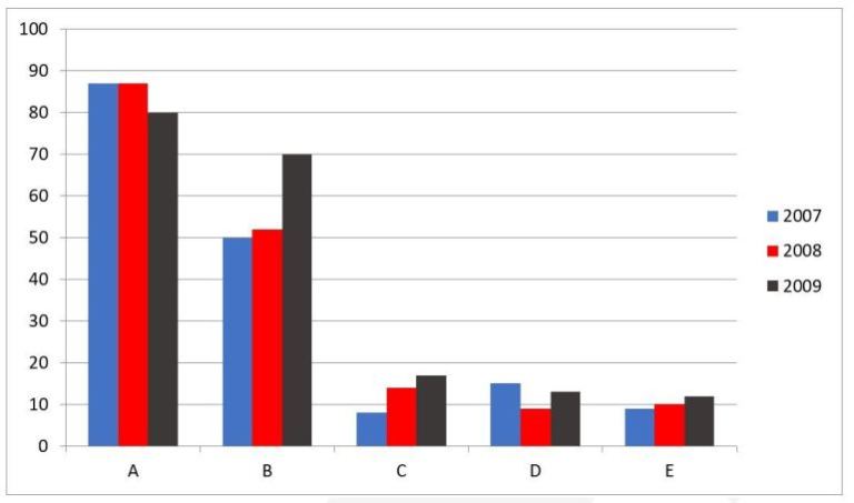
The chart compares and contrasts data on the changes in the number of films produced in five countries over a period of three years.
An overview of the diagram reveals that the number of films produced by A and D countries witnessed an upward trend over a period surveyed while the reverse was true for countries B, C and E. To specify, country A had the highest number of films produced.

In the year 2007, the number of films produced in country A was 86 films. This figure stayed stable one year later before slow decrease to nearly 80 films in 2009. In the addition, the figure for country D saw a decline slight from 15 films in 2007 to 9 films in 2008 and this figure increased marginally to 12 films in 2009.

On the other hand, the reverse was true for countries B, C and E. The year 2008, saw a rose slightly from 50 films to 52 films in 2009, after 50 films increased in the first years, climbed to about 70 films in the following three years. the period also a rise slow in the number of films produced in country C to 8 films in 2007 to 14 films in 2008. Subsequently, there was a saw dramatic growth of the films produced to 17 films. Similarly, the figure for country E grew slightly to 9 films in 2007 to 10 films in 2008 before the whose figure increased to 11 films in the end in 2009.

  • IELTSWritingTask1.jpg


Holt  Educational Consultant - / 15385  
Mar 16, 2022   #2
A chart is different from a diagram. A chart represents a given measurement for a specific series of comparisons. A diagram presents an illustration of development or creation instructions. Incorrect use of the terms or interchanging the use of the terms chart and diagram will cause point deductions due to improper word usage and confusing presentation formats.

The writer failed to completely identify the image presented. As there there are several types of charts represented in actual reports, the report must contain a specific image identification such as "a columnar bar chart" in this instance. Incomplete identification will result in a lower accuracy score.

There is also a difference between an overview and a trend. An overview refers to a general outline or summary. A trend indicates a general course representation. The second paragraph is a trending paragraph, not a summary overview.

Problems with word usage, due to the author's unfamiliarity with actual terminologies in reference to their meaning will cause lower than expected scores for this essay. The constant incorrect word usage tends to create a confusing report that is not aligned with the original presentation.


Home / Writing Feedback / The chart compares and contrasts data on the changes in the number of films produced in 5 countries
Need Writing
or Editing Help?
Fill out one of these forms:

Graduate Writing / Editing:
GraduateWriter form ◳

Best Essay Service:
CustomPapers form ◳

Excellence in Editing:
Rose Editing ◳

AI-Paper Rewriting:
Robot Rewrite ◳

Academic AI Writer:
Custom AI Writer ◳