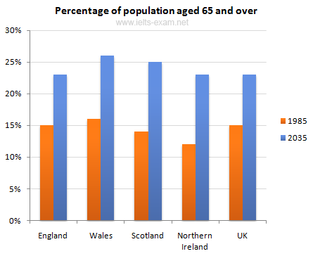
The chart below gives information about the UK's ageing population in 1985 and makes predictions for 2035.
Summarize the information by selecting and reporting the main features, and make comparisons where relevant.
Write at least 150 words.
The bar graph illustrates data on people 65 years old in 1985 and prediction in 2035. Overall, it can be seen that Wales was a country getting the highest old-people population in 1985 whereas North Ireland was the lowest population in the Great Britain.
In 1985, the percentage of old-people in Wales was around 16 percent of common people of this nation and higher than England, the second highest population of people over 65s, was approximately 15 percent. However, Scotland and North Ireland were the lowest (about 14 % and 13% respectively). In addition to, the average of aged 65s people in four countries was 15 percent of the whole populace.
Based on the calculation of data, Wales will still become the highest proportion of people over 65s in UK (approximately 27%) and will be followed by Scotland about 25 percent. Interestingly, England will be the lowest percentage of old-people population similar to North Ireland (around 23 percent). Additionally, the mean of people over 65s in UK, which is predicted, will increase from 15 in 1985 percent to 23 percent of total populace in 2035. (184 words)

the UK's ageing population in 1985 and makes predictions for 2035
