please check my writing and correct my mistakes,then give a score
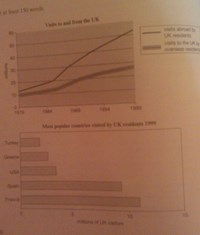
The first chart gives information about travel to and from the UK. The chart shows that between 1979 and 1999, there are most people that have visited out of UK by the UK residents rather than the people that have visited UK by overseas residents. In 1979 the visitors were about 10 millions people and after 1986 this process have increased significantly until 1999 and the biggest difference in amount of people that have visited the UK and UK residents that have visited abroad, related to the year of 1999.
In the second chart we can see the most popular countries visited by UK residents in 1999. It is evident from chart that most of UK residents like to visit the France and Spain and less of them like Turkey for traveling there. The visitors summation of 3 countries of USA, Greece and Turkey have been as amount as Spain, singly.

the charts
