Unanswered [5] | Urgent [0]
  

Home / Writing Feedback   % width   Posts: 4


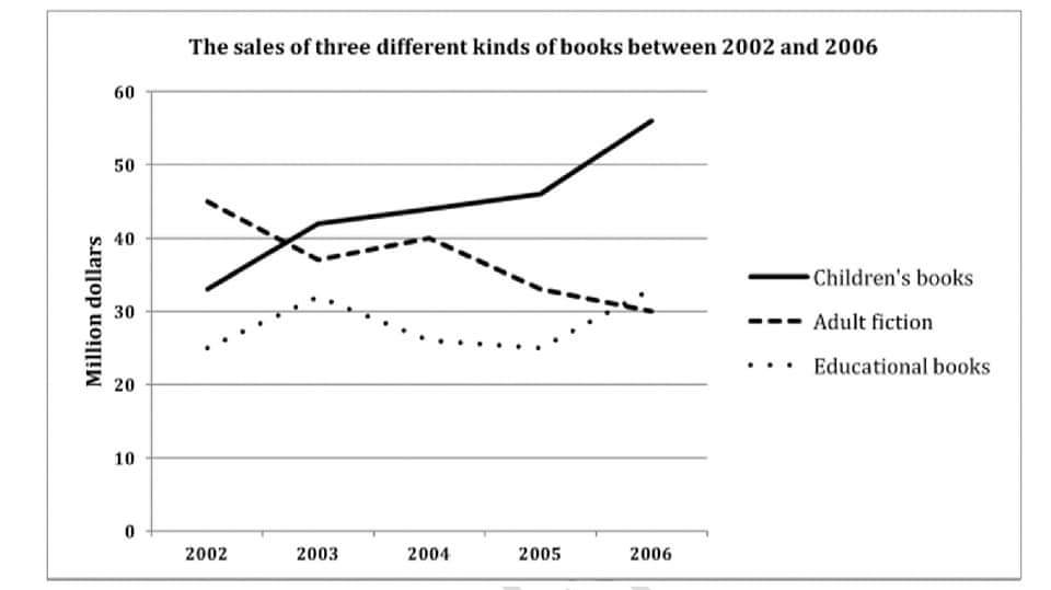
The chart show sales of three different kinds of books between 2002 and 2006


annie2003 1 / -  
Aug 16, 2020   #1

money spent on books


The line graph illustrates how much money people spend on three types of books over a period of four years from 2002.
Looking at the graph, it is immediately obvious that the expenditure on children's books and educational books had an upward trend whereas those of adult fiction decreased during the observed period.

In 2002, people spent the most on adult fiction and reached 45 million dollars. This was significantly higher than that of children's books and education books, which was 35 and 25 millions dollars respectively. Then yearly spending on adult fiction reduced to 38 million dollars in 2003. Although its sales rose slightly by 2 million dollars, it continued to fall and stood at 30 million dollars at the end of the period.

By contrast, the payment for two kinds of remainder books experienced a growth of nearly 10 million dollars from 2002 to 2003. In the next two years, while sales of children's books modestly went up, there was a decline of 6 million dollars in the spending on educational books. Between 2005 and 2006, the amount of money pay for them rose gradually.

  • inbound6046465627801.jpg


Cookieboy 2 / 4  
Aug 17, 2020   #2
First line: spend => spent
I think you should rewrite the first sentence of the second paragraph: "...fiction with the figure reaching 45 million dollars."
sherlockholmes - / 2  
Aug 17, 2020   #3
from 2002 to 2006
you don't need to use "Looking at the graph", just "It's easy to see"
"the amount of money pay for them rose gradually." it should be "paid"
Holt  Educational Consultant - / 15393  
Aug 17, 2020   #4
To be more precise in your descriptive terms for the image, explain how the illustration is represented differently for each aspect. That means, you should indicate what is represented by the flowing line, broken line, and dotted line in the graph. There should also be a reference in the overview to the million of dollars measurement representation. There is also the problem of your failing to indicate the start and end date of the measurements. Part of the requirement of the summary overview is preciseness of the information, so you should make sure you represent all required aspects when you give the short form of the report.

You need to indicate the end of the period in the actual report. When you forget to indicate the end date, the information becomes questionable. The graph does not make sense anymore. So you have to make sure that you specify both the start and end date every so often in the presentation.


Home / Writing Feedback / The chart show sales of three different kinds of books between 2002 and 2006
Need Writing or Editing Help?
Fill out one of these forms:

Graduate Writing / Editing:
GraduateWriter form ◳

Best Essay Service:
CustomPapers form ◳

Excellence in Editing:
Rose Editing ◳

AI-Paper Rewriting:
Robot Rewrite ◳

Academic AI Writer:
Custom AI Writer ◳