Unanswered [0] | Urgent [0]
  

Home / Writing Feedback   % width   Posts: 6


The chart below shows the amount of money per week spent on fast foods in Britain. WRITING TASK 1.


MaximKlopunov99 13 / 21  
May 11, 2016   #1
Can you give me all your suggestions about this essay and the average score, please.

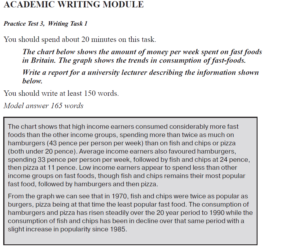
The chart below shows the amount of money per week spent on fast foods in Britain. The graph shows the trends in consumption of fast foods. Write a report for a university lecturer describing the information shown below.

The chart shows that low income earners consumed significantly less fast foods than the other income groups spending more than twice on fish and chips (18 pence per person per week) than on pizza and less than 15 pence per person per week on hamburgers. Average income earners favoured hamburgers spending 34 pence per person per week followed by fish and chips at 25 pence per person per week than pizza at 20 pence per person per week. High income earners also favoured burgers spending on them 43 pence per person per week followed by pizza (19 pence per person per week) then fish and chips (16 pence per person per week).

From the graph we can see that the trends in consumption of fast foods were changing for over the 20 year period. In 1970 the consumption of fish and chips has been in decline till 1985, while the expenditure of hamburgers and pizza has risen steadily over the 20 year period to 1990. In 1985, the popularity of fish and chips has been in slight increase.

  • .png


ichanpants89 16 / 742  
May 11, 2016   #2
Task Achievement
- You were able to generally address the task, but the format is inappropriate. This is because there is no clear overview. I notice that you were trying to write one, but it seems too general by only saying 'were changing'. This made your task achievement only scored 5.0.

Coherence and Cohesion
- As you can see, you were able to present the report summary from the graph and chart, but unfortunately, there is no overall progression. You were only used few cohesive devices. This dragged your score down to 5.0.

Lexical Resource
- Unfortunately, your vocabulary was limited. Many repetitive words were existed, such as 'per person per week'. You've mentioned it 8 times. This makes you hard to score beyond 5.0.

Grammatical Range and Accuracy
- Choosing present perfect was a bad decision. The time signal was already obvious that it indicates that something happened in the past. Therefore, you need to write the proper tenses according to the time signal. This makes your score only reach 5.0

Overall, this essay is worth between 4.5 - 5.0 due to several reasons that I've mentioned above. However, do not worry, this is just a prediction score, not an actual one. You can practice harder by seeing many sample answers from many valuable websites in order to improve your writing. Good luck for the next practice :)
justivy03 - / 2265  
May 11, 2016   #3
Hi Maxim, the analysis you made for this graph is very accurate, you were able to provide a relevant review to the bar graph and the details you incorporated in the analysis is well received, meaning it is easily understood by the readers.

However, I noticed that the representation of your unit of measurement is not in a form of symbol, like the pence, now, this is fine as it is quiet difficult to do so especially when you're not familiar with the strokes in the computer keyboard, but if you can, try to do so, as this adds formality to your essay, you know that effect of professionalism will be given more emphasis.

Moreover, I notice that you lack punctuation marks on this analysis, punctuation mark such as a comma (,), is needed to give your sentences a break and a breather for your readers, this may be a minor detail but it definitely helps polish your analysis. I suggest you read through your analysis and place the proper punctuation marks when needed.
OP MaximKlopunov99 13 / 21  
May 12, 2016   #4
Hello Mochtar,

frankly speaking, to write this essay I used the simple from the IELTS textbook.
What do you think about this example? Up to you, is it a good or a bad example of an IELTS writing task 1?


  • .png
akmalnov 3 / 6  
May 14, 2016   #5
Hi max,

Here my feedback to your essay, I identify you missing the paraphrasing question toward the title of your essay concern about. you just right away to explain overall aspect in your introduction part. If you don't mind, here my suggestions of paraphrasing question as an example:

The multiple charts presents the ratio of money spent in three different variant of fast foods: Hamburger, Fish Chips, and Pizza measured by pence per person in a week. Likewise the trend of fast foods usage between 1970 and 1990 in England.
Ilmi_03 47 / 67  
May 15, 2016   #6
Hy Maxim.

It is hard for me to distinguish both of two graph and the explanation in your writing.
It is better to introduce the type of graph firstly, then explain what is the given chart show. Then, turn to the second graph and explain it. Afterward, giving overview for both of them. :)


Home / Writing Feedback / The chart below shows the amount of money per week spent on fast foods in Britain. WRITING TASK 1.
Do You Need
Academic Writing
or Editing Help?
Need professional help with your assignments? Fill out one of these forms:

Graduate Writing / Editing:
GraduateWriter form ◳

Best Essay Service:
CustomPapers form ◳

Excellence in Editing:
Rose Editing ◳

AI-Paper Rewriting:
Robot Rewrite ◳