Oil annual consumption & oil employment/unemployment rate
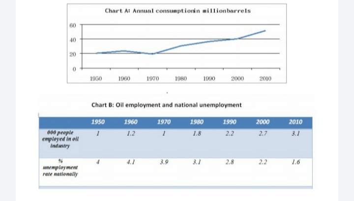
Chart A below shows the rate of oil consumption (in millions of barrels) in a small country from 1950 to 2010. Chart B shows the number of people employed in the oil industry in that country and the rate of unemployment throughout the country over the same time.
Write a report summarizing the information. Select and describe the main features and make comparisons where relevant.
ANSWER
The line graph gives information about the annual use of oil within a timespan of 60 years in a country, while the table illustrates oil employment and national employment in that country during the same period.
Regarding the oil consumption, the figure registered 20 million barrels in 1950, and remained stable in the next two decades. Since then, the amount of consumed oil witnessed a nearly three- fold increase, peaking over 50 million barrels in 2010.
This trend was also reflected in the number of workers in the oil industry. Fluctuating around 1000 people from 1950 to 1970, the number climbed significantly by three times, which reached 3100 at the end of the period.
Turning to the national unemployment rate, around 4% of the population was jobless in between 1950 and 1970. However, there was a discernible improvement in the country's job situation, as the rate declined by over 2% in the following 40 years.
Overall, there was a correlation in the consumption of oil per year and the number of oil industry workers. In the meantime, the unemployment rate also more than halved throughout the period.
(187 words)

20200620_190233.jpg
