Unanswered [3]
  

Home / Writing Feedback   % width   Posts: 4


IELTS task 1-The charts below give information on the ages of people when they got married...


madeline8484 1 / 1  
Oct 18, 2017   #1

proportion of getting married people by different age groups


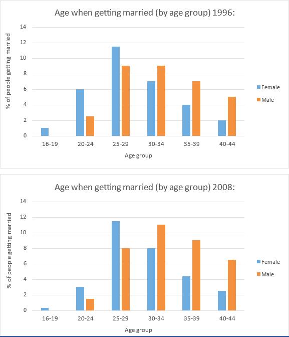
The bar charts show data about six age groups of men and women who got married in an unknown country in 1996 and 2008
Overall, the proportion of younger age groups that got married decreased, while older age groups increased. Moreover, the percentage of male and female aged 16-19 occupied the lowest quantity of marriage.

Looking at the charts in more detail, it is worth noting that there was a significant drop in the percentage of female aged 20-24, from 6% to only 3%. In contrast, the proportion of married women aged 30-34, 35-39 and 30-44 had grown from 7% to 8%, 4% to around 4.2% and 2% to about 2.2%, respectively. Meanwhile, the percentage of female aged 25-29 that got married remained no change, at almost 12%.

Also noteworthy is that there was a slight decline in the percentage of married men aged 20-24 and 25-29, from around 2.2% to under 2% and 9% to only 8%, respectively. On the other hand, the proportion of male who married in the age between 30-34, 35-39 and 40-44 had risen noticeably, from 9% to 11%, 7% to 9% and 5% to almost 7%, respectively.

  • BarCharts.png


scully_vananh 3 / 2  
Oct 18, 2017   #2
Some feedbacks from me:

1. You don't need to mention "in an unknown country" in the introduction.

2. "remained no change" should be "remained unchanged"

3. "Also noteworthy is that" => It is also noteworthy that...

4. I think your essay listed too much numbers, meanwhile there isn't much comparision.
pier 11 / 37  
Oct 18, 2017   #3
@madeline8484
Your writing is very understandable. "Looking at the charts in more detail," very good expression.
Just one thing, I don't see any reference to the year in your writing except introduction. Since without referencing, it is very hard to find out if the changes happened in one year or different years.
Holt  Educational Consultant - / 15460  
Oct 18, 2017   #4
@madeline8484 your summary overview is missing a few details that could have made it stronger. You should not have immediately jumped to the trending sentence as that is the last presentation in this particular paragraph. What you needed to do was list the ages that were for consideration in the graph and the measurement method. Base the information you are presenting only on the information presented in the essay. While it is acceptable to say "in an unknown country" as that is implied in the essay and could be based on an obvious observation, which is part of your analytical ability presentation, you could have also not mentioned the country at all and it would have no effect on your score. By adding the "unknown country" reference though, you showed a keener analytical skill that can be used to help boost your final score in the TA aspect. When you discuss a comparative chart, you should never forget to mention the years at the start of the paragraph since the reader does not know which aspect of the chart you are presenting for their consideration. A quick mention within the first sentence accomplishes that task. Now, while you presented an effective individual comparison per chart, there should have also been a cross comparison between the two years in order to create a full, and in-depth analysis of the essay. That would have created a higher scoring basis for your essay. However, even without that, your essay is verging on getting a higher than average mark in the overall score.


Home / Writing Feedback / IELTS task 1-The charts below give information on the ages of people when they got married...
ⓘ Need Writing or Editing Help?
Fill out one of these forms for professional help:

Best Writing Service:
CustomPapers form ◳

Graduate Writing / Editing:
GraduateWriter form ◳

Excellence in Editing:
Rose Editing ◳

AI-Paper Rewriting:
Robot Rewrite ◳