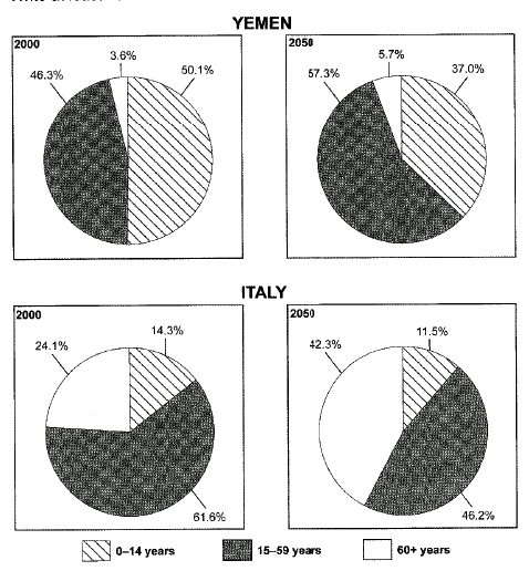
The charts below give information on the ages of the populations of Yemen and Italy in 2000 and projections for 2050
Summarise the information by selecting and reporting the main features, and make comparisons where relevant
The pie-charts indicate data about citizens of two countries, with different infrastructures, divided by age group in 2000 and expectations for 2050.
It can be seen from the charts that Yemen and Italy have completely different rates at old people and young children indexes.
In 2000, the percentage of 15-59 year-old-people in Italy was 61.6 per cents while, in Yemen, this percentage was less by 15 per cents. The figures for people above 60 years were also higher in Italy (24.1%). Yemen, at the same index had only 3.6 per cents. However, young children, below the age of 14, in Yemen, outnumbered ones in Italy, 50.1 and 14.3 per cents respectively.
In 2050, Yemen is expected to have more residents at the age from 15 to 59 (57.3%) and old people (5.7%). In contrast, Italy is more likely to experience a reduction in the proportion of adolescents, middle aged people (46.2%) and children under 14 years old (11.5%). Nevertheless, the figures for elder people in Italy are predicted to be more by almost 18.3 per cents, whereas the percentage of young children is going to be less by 13 per cents.

20140416_21.09.41.png
