This is the first time I work with combined charts and I found it hard to arrange ideas. Please correct and advise me on that. Thank you a lot!
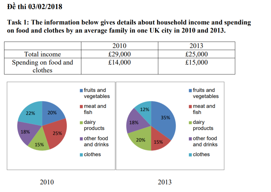
The given table describes the total earnings of a median family and the amount of money they paid for food and clothes in 2010 and 2013. The pie chart illustrates more specific proportion data of the later expenditure divided into five different categories. Generally, despite a fall in total family income, there was a salient increase in fruits and vegetables' spendings in the researched period.
As can be seen, the total money gained by a mediocre UK household in 2013 was 4,000 euros less when compared to 29,000 euros in 2010. In spite of that fact, people had the tendency to pay more for foodstuffs and attires in 2013 than in 2010, with 15,000 euros and 14,000 euros, respectively.
Regarding the circle chart, there was a decline in the proportion of clothes budget from 22% in 2010 to 12% in 2013. The percentage spent on meat and fish also dropped by 10% from 25% in 2010. In contrast, dairy products witnessed a growth in its rate from 15% to 20% in the same period. However, the most significant rise was 15% in the fruits and vegetables segment as it reached 35% in 2013 while there was no change in the figure of other food and drinks.
household income and spending on food and clothes
The given table describes the total earnings of a median family and the amount of money they paid for food and clothes in 2010 and 2013. The pie chart illustrates more specific proportion data of the later expenditure divided into five different categories. Generally, despite a fall in total family income, there was a salient increase in fruits and vegetables' spendings in the researched period.
As can be seen, the total money gained by a mediocre UK household in 2013 was 4,000 euros less when compared to 29,000 euros in 2010. In spite of that fact, people had the tendency to pay more for foodstuffs and attires in 2013 than in 2010, with 15,000 euros and 14,000 euros, respectively.
Regarding the circle chart, there was a decline in the proportion of clothes budget from 22% in 2010 to 12% in 2013. The percentage spent on meat and fish also dropped by 10% from 25% in 2010. In contrast, dairy products witnessed a growth in its rate from 15% to 20% in the same period. However, the most significant rise was 15% in the fruits and vegetables segment as it reached 35% in 2013 while there was no change in the figure of other food and drinks.

1.png
