Writing task 1 - CamIELTS 10 (gas emissions)
This is my first task , please help me check it!
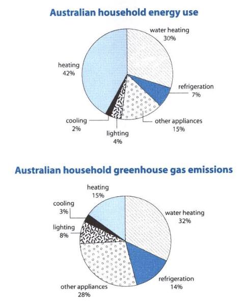
"The first chart below shows how energy is used in an average Australian household. The second chart shows the greenhouse gas emissions which result from this energy use.
Summarise the information by selecting and reporting the main features, and make comparisons where relevant."
A glance at two pie charts provided reveals the relationship of using energy and releasing greenhouse gas in Australia.
It is clear that the proportion of power which is using for heating is the most, while greenhouse gas emission is not equivalent too, also water heating has great contribution in 2 graphs.
Standing at 42%, the percentage of heating is on top of using energy in Australia, followed by that of water heating, at approximately 30%, the second-highest overall. In stack contrast, the figure for other appliances makes up 15% and the rest, including refrigeration, lighting, cooling occupy trivial proportion, just 7%.
In term of greenhouse gas release, water heating and other appliance are the major causes, with 32% and 28% respectively. In comparison with data of refrigeration and heating are almost equal, about 15% each. Both lighting and cooling is the lowest of contributing to production of total gas emissions, just 11%.

