free time activities - the line graph
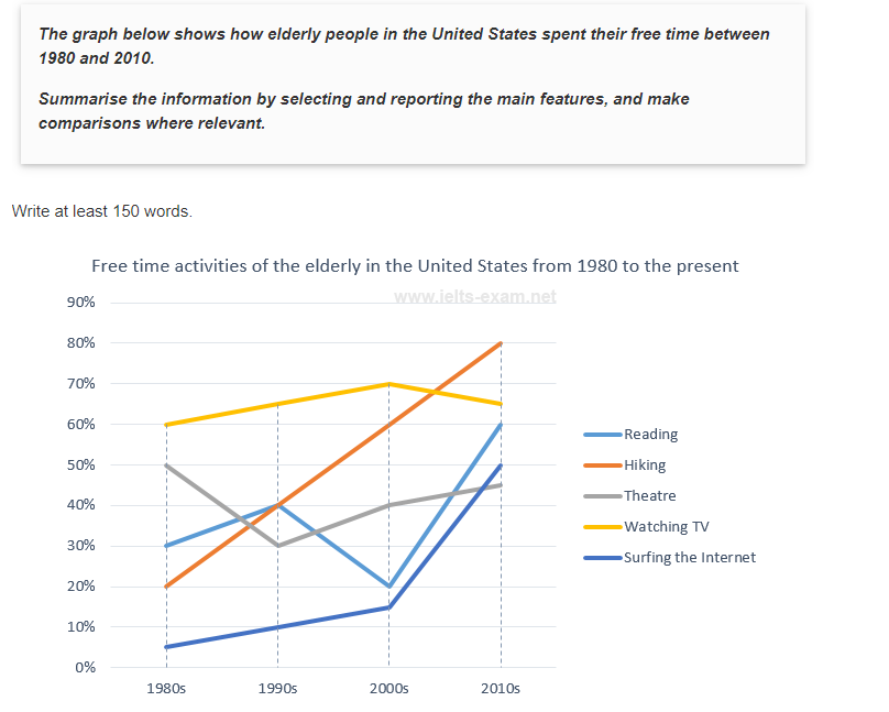
The line graph illustrates the proportion of the old people doing different activities in their spare time in the period of 30 years starting in 1980 in America.
Overall, it is clearly evident from the graph that the percentage of free time activities done by the elderly greatly differed over the time frame. While the percentages of most of the given activities witnessed an upward trend, that of going to the theatre decreased slightly. By the end of the period, hiking is preferred the most among the five activities.
As can be seen from the graph, in 1980, watching TV took the lead with 60% of the old people, which was twice as large as the percentage of people reading and almost three times as large as that of surfing the Internet. The first 20 years witnessed a gradual increase in the rates of the elderly watching TV and surfing the Internet, both rising by 10%. By contrast, the figure for reading hit the bottom at only 20% in 2000. From 2000 to 2010, there was a slight decrease in the number of people watching TV, while that figure for reading and surfing the Internet went up rapidly to 60% and 50% respectively.
In 1980, the percentages of old people attending the theatre experienced a quick drop to 30% in 1990, before increasing to approximately 45% in 2010. The number of people joining hiking started at only 20%, that figure went through a period of dramatic increase to 80% at the of the period, surpassing the number of people watching TV, which was only 65%.

line.png
