I will be taken IELTS examination on first of December, please help me.
Thanks a lots.
This is
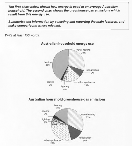
The first chart below shows how energy is used in a average Australian household. The second chart shows the greenhouse gas emissions which result from this energy use.
First chart: Heating (42%), water heating (30%), other appliances (15%), refrigeration (7%), lighting (4%) and cooling (2%).
Second chart: Heating (15%), water heating (32%), other appliances (28%), refrigeration (14%), lighting (8%) and cooling (3%).
The charts described the percentage of different energy types was used by household in Australia and its greenhouse gas emissions polluted to environment.
Overall, the top kind of energy was spent, have created the top percentage of greenhouse gas emissions in total, such as heating and water heating.
Looking at the both pie charts, the power heated water accounted for 30% which created the highest percentage of carbon dioxide (CO2), leading of greenhouse gas, at 32%. Following by the rate of emission from other appliances was 28% while the energy was consumed by them stood at the third place in list. It was counter-intuitive with spending power on heating which was used the most, nevertheless, their pollution made up only 15%. The rank of being made carbon dioxide was followed by refrigeration and lighting which was responsible for 14% and 8%, respectively, the proportion of power which used for them, have made up 7% and 4%. The brightest point was percentage of energy for cooling, it was lowest in list at 2% and made only 3% gas emissions to the environment.
Thanks a lots.
This is
Writing task 1 - Test 1 - Cambridge 10.
The first chart below shows how energy is used in a average Australian household. The second chart shows the greenhouse gas emissions which result from this energy use.
First chart: Heating (42%), water heating (30%), other appliances (15%), refrigeration (7%), lighting (4%) and cooling (2%).
Second chart: Heating (15%), water heating (32%), other appliances (28%), refrigeration (14%), lighting (8%) and cooling (3%).
The charts described the percentage of different energy types was used by household in Australia and its greenhouse gas emissions polluted to environment.
Overall, the top kind of energy was spent, have created the top percentage of greenhouse gas emissions in total, such as heating and water heating.
Looking at the both pie charts, the power heated water accounted for 30% which created the highest percentage of carbon dioxide (CO2), leading of greenhouse gas, at 32%. Following by the rate of emission from other appliances was 28% while the energy was consumed by them stood at the third place in list. It was counter-intuitive with spending power on heating which was used the most, nevertheless, their pollution made up only 15%. The rank of being made carbon dioxide was followed by refrigeration and lighting which was responsible for 14% and 8%, respectively, the proportion of power which used for them, have made up 7% and 4%. The brightest point was percentage of energy for cooling, it was lowest in list at 2% and made only 3% gas emissions to the environment.

ielts10test1writing1.png
