Unanswered [1] | Urgent [0]
  

Home / Writing Feedback   % width   Posts: 2


(Ielts task1) how energy is used in an average Australian household and the greenhouse gas emissions


Mrlong 1 / -  
May 27, 2020   #1

The two charts analysis


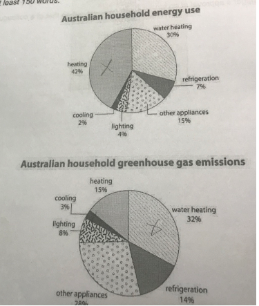
The first chart illustrates the percentage of Australian household energy use and the second chart describes the proportion of green house gas emissions released from this energy use.

Overall, in the first chart cooling makes up the smallest part of energy use, while heating is the largest segment. In the chart of greenhouse gas emissions, water heating is the most significant part and the lowest part is made by cooling.

In the first chart, heating accounts for 42% of energy use, being the largest part and other appliances and refrigeration are at 15% and 7%, respectively. However, only 4% of energy is used for lighting and cooling is the lowest part at 2%.

In the second chart, 32% of gas emissions released from from water heating, compared to 28 % of other appliances, 15 % of heating , and 14% of refrigeration, and the figures for gas emissions which result from cooling and lighting are much lower, with 3% and 8% respectively.

  • metqu8a.png


Holt  Educational Consultant - / 15384  
May 28, 2020   #2
For clarity requirements, you need to present the information from the charts (including the type of chart) in individual sentences. Do this because the minimum sentence requirement is 3 sentences per paragraph. You score less in the GRA and C&C section when you use run on sentences the way you did throughout this report. You are missing several key points in your summary, including the trending statement. Offer a better summary of the discussion points, trending statement, and measurement type next time.

There should have been a comparison discussion / paragraph presentation in this essay. For every energy use, there is a specific greenhouse emission related to it. Look at the charts. The instructions told you to make comparisons where relevant. You should have indicated the corresponding comparative measurements for each partnered discussion point:

water heating energy - water heating green house emission
refrigeration energy - refrigeration emission
etc.

Since there are 6 comparative points per chart, your 2 reporting paragraphs should have presented the comparisons based on a 3 topic presentation per paragraph. That would have created a more coherent and cohesive discussion presentation:

Par. 2: Cooling, heating, water heating
Par. 3: Refrigeration, other appliances, lighting

Using the chart comparison method, you should be able to develop a well developed and cohesive report based on the 2 charts provided. By the way, identify the chart using specific descriptions. It isn't just a chart, it is a pie chart. There are several types of charts used in the task 1 essay so you have to be specific when describing it to the reader.


Home / Writing Feedback / (Ielts task1) how energy is used in an average Australian household and the greenhouse gas emissions
Do You Need
Academic Writing
or Editing Help?
Fill out one of these forms:

Graduate Writing / Editing:
GraduateWriter form ◳

Best Essay Service:
CustomPapers form ◳

Excellence in Editing:
Rose Editing ◳

AI-Paper Rewriting:
Robot Rewrite ◳

Academic AI Writer:
Custom AI Writer ◳