Unanswered [0]
  

Home / Writing Feedback   % width   Posts: 3


England female unemployment rates in each country of the United Kingdom


Emma Nguyen 1 / -  
Mar 27, 2017   #1

statistics of unemployed women in England


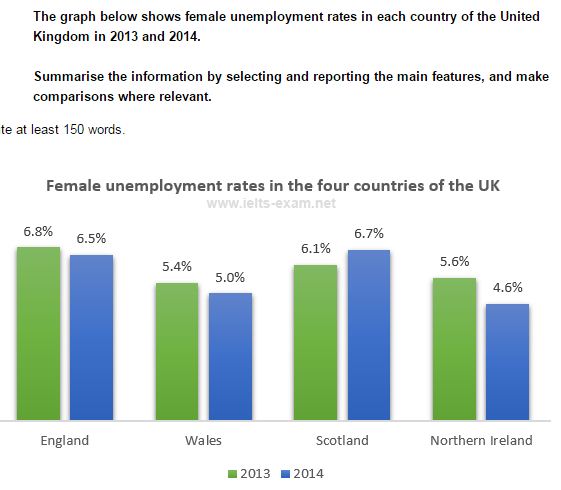
The graph below shows female unemployment rates in each country of the United Kingdom in 2013 and 2014.
Summarise the information by selecting and reporting the main features, and make comparisons where relevant.

The bar chart illustrates the percentage of women unemplyed in the UK between 2013 and 2014.
From an overall perspective, women out of job in both countries Wales and the Northern Ireland had smaller figure while in England and Scotland women without jobs increased respectively from 2013 to 2014.

According to the bar charts, in 2013, women out of job makes up 5.4% in Wales while the figure for women unemloyed in the Northern Ireland, with 5.6% respectively. Howerver, in the Northern Ireland women unemployed fell 1% and in Wales fell to 0.4% in 2014.

Looking more details, the percentage of unemployed women in England hold the greatest bad indiviual position, with 6.8% in 2013, but in 2014 the female without jobs descreased to 0.3%. Furthermore, in terms of women out of jobs in Scotland reflected against comparison rates for which form of bad conditions lives pushed more unemployed women rates in two years and increased from 6.1% to 6.7% respectively.

Plz help me some advise about this task.

  • Capture.JPG


Holt  Educational Consultant - / 15461  
Mar 27, 2017   #2
Emma, I would have approached the comparison presentation of the bar chart in a different manner. I would have done it either in a progressive (lowest to highest) or regressive (highest to lowest) percentage presentation based upon the year of the information. The country in the UK would properly represented anyway as I presented the bar information. By doing it that way, the mechanical nature of the presentation, caused by the obvious choice of just comparing the digits as it was presented, would have been avoided. It would have also allowed for a better analysis on my part, as the writer, of the information provided so I would have been able to present some additional information that might have been overlooked using your current presentation. By presenting the information per paragraph using the yearly basis, the essay would have also been easier to follow as it does not confuse the reader by combining the year comparison in the same area. Dividing the yearly presentation would have made it easier for the reader to recall the information as well.

The major problem of your essay is that you did not write enough sentences to qualify your statements as paragraphs. All of the presentations have only 2 sentences rather than the required 3 sentence (minimum) presentation. This mistake will definitely drag down your overall score, regardless of the strength of your discussion. You were also a bit careless and sloppy in your presentation because you did not use periods to create logical schools of thought within your paragraphs. Instead, you just created long run on sentences through the constant use of commas. Learn to use the period. That is a writers best friend and will always help to increase your scores far better than these run on sentences can.

Based on the aforementioned issues, I think your final score for this essay will be no more than a 4.
Reza_Hidayat 13 / 18  
Apr 2, 2017   #3
@Emma Nguyen

You should pay attention with spelling, you also do not cover all key features, try to find the key feature like difference or similarities. Furthermore, you present ideas but these are not arranged coherently and then you use limited range of structure.


Home / Writing Feedback / England female unemployment rates in each country of the United Kingdom
ⓘ Need Writing or Editing Help?
Fill out one of these forms for professional help:

Best Writing Service:
CustomPapers form ◳

Graduate Writing / Editing:
GraduateWriter form ◳

Excellence in Editing:
Rose Editing ◳

AI-Paper Rewriting:
Robot Rewrite ◳