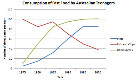
The three graphs given illustrate how teen Australian consume junk food fluctuated over a period of 25 years . These graphs prove the progressive popularity of pizza and hamburgers .
According to the graphs , in 1975 , fish and chips stood at 100 eaten per year which it was the maximum point . In 1985 , consumption came with a considerable reduction of about 20 . After which consumption soar moderatly to nearly the same leve as it was in 1975 betwwen 1980 and 1985 . However this upward trend broken and consumption dipped dramatically over the next 15 years to reach a little less than 40 times per year . Pizza and hamburgurs experienced a huge growth . Hamburgers had a sharp rise unto a little above 80 over a period of 10 years . This was followed by another increase to attais 100 . After which , it remained relatively constant . This pattern was repeated for pizza ( a quick increase to a little above 80 in 1995 and after that a static trend until 2000 ) .
To som up , at the beginning , fish and chips were at highest level while the lowest figurs could be observed in pizza and hamburgers but at the end of survey it was vice versa .
---
Please tell me about the grammatical mistakes .

ieltstask1fastfo.jpg
