Unanswered [1]
  

Home / Writing Feedback   % width   Posts: 3


Task 1: 2 flow chart (average monthly spend on children's sports and participation in 3 sports)


thai1491 1 / -  
Dec 5, 2018   #1

money spent for children's physical activity


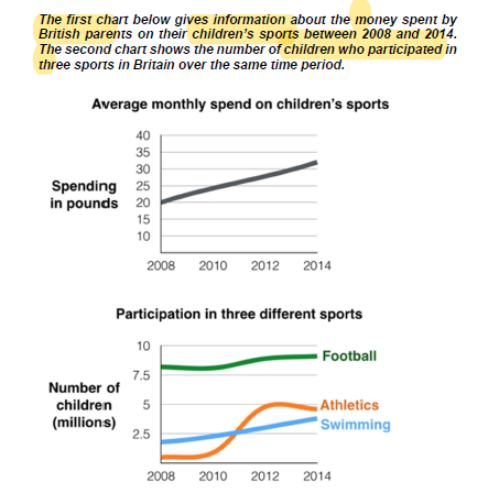
The line graphs illustrate two sets of data about the monthly amount of money that British parents spent for their children's sport since 2008 to 2014 and the number of kids who take part in football, athletics, and swimming. Overall, the first visual shows that there is a linear increase in children's sports spending of parents. Different than the first one, the second line graph demonstrates three different trends of balancing, slight fluctuate, and gradual increase of football, athletics, and swimming respectively.

First of all, only in 6 years, the amount of money that parents willing to pay for their children's sports has rocketed from 20 pounds in 2008 to over 30 pounds in 2014.

The number of children who participate in the 3 sport also shows an increase in number but with different rates and trends. From 2008 to 2014, Football, which has the highest number of participants is balanced in the range between over 7.5 million and under 10 million. Athletics started off small with a quarter of 2.5 million but rocketed in 2010 and reached its peak at a little bit over 5 million in 2012. Swimming shows a similar rate of development to that of the parent's monthly spending on children's sport. It was just under 2.5 million in 2008 but gradually increasing since then and will catch up with athletics at this rate.

  • The task


Holt  Educational Consultant - / 15461  
Dec 6, 2018   #2
Cao, your first sentence is confusing to read. It tends to confuse the reader because, rather than separating the data content for the two graphs, you decided to create a run-on sentence that combines 2 separate discussion points in one sentence. Thus making is difficult for the reader to comprehend. It becomes confusing to understand in this instance. A separation is required for the presentation. Here is a sample:

Two line charts have been provided for this discussion. The first chart indicates the amount of money that British parents tend to fork out in terms of fees for the sports their offspring played in 2008 and 2014. The second line chart, deals with information regarding the juvenile participants in football, athletics, and swimming. The number of young participants was counted in the millions. The trend for the first graph shows and increasing amount of spending for sport participation while the second graph indicates a plateauing for child participants in the 3 sports.

A separation of information presentation helps the reader keep track of the presented information and also, allows the reader to understand the series of upcoming presentations for the succeeding paragraphs.

There best way to ensure that you will be presenting a clear explanation of the data is by allowing your information to be presented over a series of 4 paragraphs. That way you can allot the presentation this way:

Par. 1 - Summary overview (with optional trending statement)
Par. 2 - First chart discussion
Par. 3 - Second chart discussion
Par. 4 - General trending statement

The trending statement can be presented anywhere within the 4 paragraphs. While I opted to include it in the summary overview in my presentation, you may wish to present it as a separate paragraph in order to allow yourself more space to explain your understanding of both charts. Never present a stand-alone single sentence as the minimum sentence requirement per paragraph is 3 sentences. Write less than that in your essay per paragraph and you could risk a lower GRA and C&C score.

Work on the grouping of your information presentation so that your essay will be more coherent and cohesive in discussion. As of now, your presentation suffers due to the length of blurred information presentation on your part.
forielts 4 / 8  
Dec 7, 2018   #3
hi,

Despite the suggestions given above, there are other two things you should pay attention:
Do not write too many words in task 1 because not only it will run out of time for task 2, but also it shows you don't have the ability the summarize the information.

Be careful of your grammar, the charts are talking about things between 2008 and 2014, so you should use the past tense instead of the present simple.


Home / Writing Feedback / Task 1: 2 flow chart (average monthly spend on children's sports and participation in 3 sports)
ⓘ Need Writing or Editing Help?
Fill out one of these forms for professional help:

Best Writing Service:
CustomPapers form ◳

Graduate Writing / Editing:
GraduateWriter form ◳

Excellence in Editing:
Rose Editing ◳

AI-Paper Rewriting:
Robot Rewrite ◳