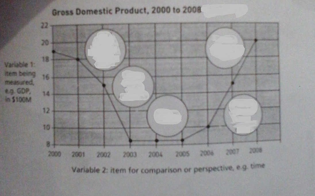
The line graph shows the changing of Gross National Product, GDP, in a particular country over eight years period from 2000 to 2008.
Overall, GDP movement varied considerably. In any case of a decline showing in the first five years, the GDP growth rocketed to more than it happened in the end period under review.
As per the line graph, GDP started at the point of $19 million in 2000, this was the second highest rate showed in the graph. While the GDP recorded to decline steadily to $15 million in two following years, the trend persisted to reach the low of trough to just under $10 million between 2003 and 2005.
A closer to the GDP's trend in the year 2006, it had shown a slight increase in amount at $10 million before experienced a breakneck pace until a peak of $20 million, a million dollar higher than the GDP's trend began in 2000.

20140923_161701.jpg
