Unanswered [4] | Urgent [0]
  

Home / Writing Feedback   % width   Posts: 3


Task 1 The graph gives information about changes in the birth and death rates in New Zealand


Osama0435 5 / 9  
Jun 18, 2020   #1

Births and deaths - history and prediction for the future


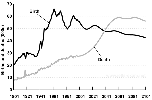
The graph below gives information about changes in the birth and death rates in New Zealand between 1901 and 2101. Summarise the information by selecting and reporting the main features, and make comparisons where relevant.

The graph compares data in New Zealand in terms of the variation in the birth and death percentages in the years 1901 and 2101.

Overall, the birth proportion increased dramatically from the beginning to the near middle of the period and declined gradually since then, while the death percentage showed a steady but significant rise almost over the period and will possibly outtake death rate.

With only around 20% in 1901, the birth rate illustrated a rapid growth and hit a high-point of about 64%. It then experienced a relatively huge fluctuation until 2041. Finally, the birth rate is predicted to show a steady downward trend from 2061 to 2101.

In the meantime, the percentage of death (around 9%) is lower than the birth (around 20%) in 1901. However, instead of demonstrating fluctuations, it underwent a distinct continued growth of 18% and will even jump from around 27% to almost 59% between 2021 and 2061. Moreover, it is estimated that it will only drop by 3% at the end of the period.

Hello Mr. Holt I wrote my Task 1 again and I did remember the mistakes that I have been told. Please let me know what are the mistakes that I should avoid while describing a line graph and is there any mistake with my writing skills that I should also avoid? Thank you.

  • IELTS_Writing_Task_1.png


Holt  Educational Consultant - / 15393  
Jun 19, 2020   #2
You should not have written 207 words for this task. Since it is only a 20 minute task, the advisable word count is anywhere from 175-190 words. Focus on the editing of the content of the essay, not the length. If you focus on the length, you will make mistakes that will affect your final score or run out of time for editing. As it is, the main problem of this essay is the paragraph formatting. The basic requirement is 3-5 sentences per paragraph, without run-on sentences. Your paragraphs are mostly comprise of 1 or 2 sentences, well under the minimum requirement. That means each paragraph is grammatically incorrect as you are presenting run-on sentences instead of a mix of simple and complex sentences per paragraph.

Additionally, long paragraphs tend to create difficult to follow explanation patterns as you are using more commas instead full stops to separate your thoughts per sentence. Use a mix of punctuation marks as well to kick up your scores. Showing your writing formality through the use of periods, commas, semi-colons, among other punctuation marks would help you do that. Read other writing samples to see how that is done.

Word clarity is also important in your essay. So, rather than saying "instead of demonstrating...", the sentence would have been clearer with one simple word change, "instead of showing". Since you are doing a formal report based on accurate measurements, you should also avoid using probable terms such as "almost 59 percent" and "relatively huge". Just say what you mean, based on the verified information from the chart.

You do not have a clear trending statement in the presentation. Learn to use verbal cues to indicate the clear start of a trending statement such as "The foreseeable trend is..." or "Based on the information, fluctuations in... show that the direction/movement/tendency..." , to show you but a few other verbal cues for "trending statement" in your presentation. You also forgot to indicate the measurement process in the summary overview (thousands). There is also the problem of your year reference, it should have indicated a "decade on decade measurement" starting from 1901, ending in 2001. Remember, the summary overview should also have at least 3 sentences. Just divide the overview of information presented in the chart to achieve that.

Try to compress your presentation. This should only be a 3 paragraph presentation. 4 paragraph presentations are for the Task 2 essay discussions.
bangbangbt 5 / 9  
Jun 26, 2020   #3
Hi, i have read your work and want to give you some feedback.

- hit a high-point of about 64% => hit a peak/peaked at 64%
- It then experienced a ... until 2041 => I think you should use future tense for this period since it's only 2020 ;)
- instead of demonstrating fluctuations => the percentage of death does not demonstrate anything, it is demonstrated on the chart. You are using a wrong verb here

Besides, when describing a trend, you can use different subject instead of repeating "the birth/death rate". Try: The period from X to Y witnessed a/an [adj] increase/decrease/fall/rise... in the birth/death rate, with its figure being Z%.

Good luck


Home / Writing Feedback / Task 1 The graph gives information about changes in the birth and death rates in New Zealand
Need Writing or Editing Help?
Fill out one of these forms:

Graduate Writing / Editing:
GraduateWriter form ◳

Best Essay Service:
CustomPapers form ◳

Excellence in Editing:
Rose Editing ◳

AI-Paper Rewriting:
Robot Rewrite ◳

Academic AI Writer:
Custom AI Writer ◳