Analysis of the petrol expenditures
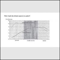
The line graph shows that plenty of drivers spend petrol in the United Kingdom and the united states. Overall, it can be seen that people more spend petrol in the richest in the United Kingdom than the United States.
Turning to a more detailed analysis in the United Kingdom, the drivers who spend petrol start from 0% in the poorest afterwards it is a rapid increase until in the middle-income and reach almost 4% of income. However, the percentage of the United Kingdom is under than United States of America but the income is increased and overtook the US' position at 4%. At the end of richest, the drivers who spend petrol in the United Kingdom fall slowly below 4% but it is still become the highest percentage.
Turning to another comparison, people spend petrol in the United states to become the biggest starting at 3.9% and it is a marked growth and almost reach a peak at 5.2% of income. Interestingly, the highest percentage of the United States the poorest because that scale fall down rapidly in the middle-income. Then, there is a decreased trend again in the richest even the proportion of drivers' petrol is below than the United Kingdom's rate at 2.3%.

297243_1.jpg
