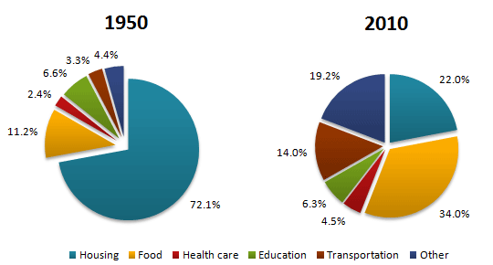
The pie charts below show the average household expenditures in a country in 1950 and 2010.
Summarise the information by selecting and reporting the main features, and make comparisons where relevant.
Write at least 150 words.
The given pie charts compares the differences between the average household expenditure in the year 1950 and 2010.
There is a significant difference between the given two years expenditure. In 1950 the major part of the spending was done on housing which is near to three quarter of the total expense. Below 10% of the total expense was done on three categories, which include health care 2.2%, transportation 3.3%, and others 4.4%. For education needed only 6.6% of the total average expenses.
On the contrary, in 2010 the highest portion of the average expense was done for food, which is 34%, followed by housing 22%. If comparing with 1950, the spending for others and transportation are increased by more than four folds, while education expenses remain roughly the same. Health care needs doubled.
In short, the important needs in 1950 was housing which was shifted to the second position in 2010. There are not huge differences between the average expenses of food and education and education and transportation in 2010.
Average Household Expenditures by Major Category

82.png
