You should spend about 20 minutes on this task.
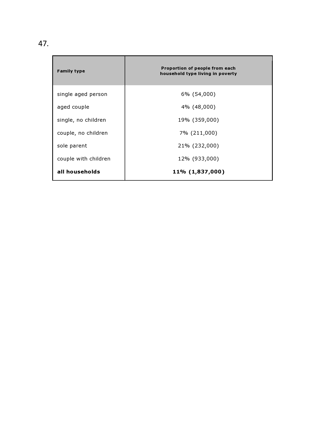
The table below shows the proportion of different categories of families living in poverty in Australia in 1999.
Summarise the information by selecting and reporting the main features, and make comparisons where relevant.
The given table chart gives information about the percentage of people in the six household types living in poverty in Australia and the percentage of all households.
From the chart it is clear that the single age person, aged couple, couples without children under poverty are below 10% , whereas childless single and couples with children ranged between 10-20% and sole parent under poverty is the highest, 21%.
Turning to detail, all household type living under poverty is 183700, which is 11% and is closely following the percentage of poor couple with children 12%, 933000. The difference in the percentage of the single aged person and couple under poverty is only 2%. Aged coupled couple, single aged couple and childless couple, which are 4%, 6%, and 7% respectively, share the first three places of lowest percentage of categories of poverty household types.
Couples with children is holding 12% which is double of single aged person that is three folds more than that of aged couple. Sole parent living under poverty have the highest proportion of household type living under poverty. This group is three folds the percentage of the childless couple, and seven folds of the aged group that is the least proportion of the people under poverty.
In short, aged couple, which is 4% (48000), is the least proportion of people living under poverty, while, sole parents with 21% (232000) is the highest proportion of people living under poverty.
The table below shows the proportion of different categories of families living in poverty in Australia in 1999.
Summarise the information by selecting and reporting the main features, and make comparisons where relevant.
The table below shows the proportion of different categories of families living in poverty in Australia in 1999.
Summarise the information by selecting and reporting the main features, and make comparisons where relevant.
The given table chart gives information about the percentage of people in the six household types living in poverty in Australia and the percentage of all households.
From the chart it is clear that the single age person, aged couple, couples without children under poverty are below 10% , whereas childless single and couples with children ranged between 10-20% and sole parent under poverty is the highest, 21%.
Turning to detail, all household type living under poverty is 183700, which is 11% and is closely following the percentage of poor couple with children 12%, 933000. The difference in the percentage of the single aged person and couple under poverty is only 2%. Aged coupled couple, single aged couple and childless couple, which are 4%, 6%, and 7% respectively, share the first three places of lowest percentage of categories of poverty household types.
Couples with children is holding 12% which is double of single aged person that is three folds more than that of aged couple. Sole parent living under poverty have the highest proportion of household type living under poverty. This group is three folds the percentage of the childless couple, and seven folds of the aged group that is the least proportion of the people under poverty.
In short, aged couple, which is 4% (48000), is the least proportion of people living under poverty, while, sole parents with 21% (232000) is the highest proportion of people living under poverty.
The table below shows the proportion of different categories of families living in poverty in Australia in 1999.
Summarise the information by selecting and reporting the main features, and make comparisons where relevant.

47JPG.jpg
