Unanswered [0]
  

Home / Writing Feedback   % width   Posts: 2


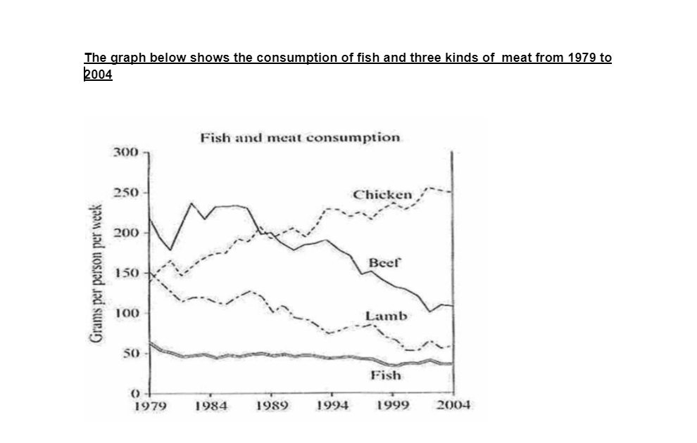
The graph below shows the consumption of fish and three kinds of meat from 1979 to 2004


lanhoangngoc 1 / -  
Oct 24, 2023   #1

fish, meat consumption graph analysis


The graph below shows the consumption of fish and three kinds of meat from 1979 to 2004.

The chart compares the fish consumption with three kinds of meat consumed from 19179 to 2004. Overall, the consumption of these kinds of meat showed a downward trend except for chicken. It is also noticeable that the fish consumption was the lowest over the given years.

At the beginning of the period, beef was head and shoulders with above 200 grams consumed weekly, followed by lamb and chicken, at around 150 and 140 grams respectively. Over the following ten years, beef and lamb consumption fluctuated widely while the figure for fish eaten went through a period of wild fluctuation at around 50 grams. By contrast, it witnessed a significant rise in chicken consumption and the year 1989 marks the point it surpassed the figure for beef.

From that time on, the chicken eaten continued to increase sharply before reaching a peak of 250 grams per capita. The consumption of land and fish saw a slight decrease at around 50 grams whereas there was a significant decrease in the figure for beef at the end of the period.

  • consumption


Holt  Educational Consultant - / 15461  
Oct 26, 2023   #2
The chart compares

While the presentation does indicate a chart, you did not identify the kind of chart presented, which poses a problem for your summary presentation. You should have mentioned that it is a line chart specifically since simply saying "a chart" is not going to give the reader an accurate representation of the image you were provided for the report.

Be more consistent in your year references. That means, use the specific years in your report. That way the reader does not have to go back to the beginning of your report and do the math for what year you are referencing. This is the weakest part of your essay. You are not clearly laying out the report to your reader due to the lack of proper year coverage. It is confusing to read.


Home / Writing Feedback / The graph below shows the consumption of fish and three kinds of meat from 1979 to 2004
ⓘ Need Writing or Editing Help?
Fill out one of these forms for professional help:

Best Writing Service:
CustomPapers form ◳

Graduate Writing / Editing:
GraduateWriter form ◳

Excellence in Editing:
Rose Editing ◳

AI-Paper Rewriting:
Robot Rewrite ◳