Unanswered [1]
  

Home / Writing Feedback   % width   Posts: 4


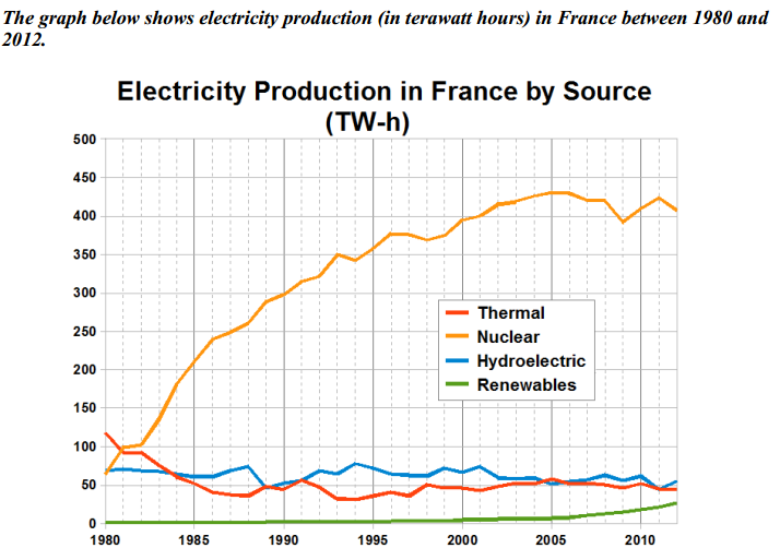
THE GRAPH BELOW SHOWS ELECTRICITY PRODUCTION (IN TERAWATT HOURS) IN FRANCE BETWEEN 1982 AND 2012


christmas 1 / 2  
Nov 18, 2020   #1

electricity production in france by source


The given graph gives information on the amount of electricity produced by four distinct sources in France over a period of 32 years starting from 1980.
It is clear that while the figures for nuclear and renewables power experienced an upward trend, the opposite was true for that for thermal and hydroelectric. Also, nuclear was the most popular means of electricity generation.

As can be seen from the graph, the year 1980 saw no disparity between the figures for nuclear and hydroelectric power, which was around 70 Tw-h. For the next 25 yeas, the amount of electricity generated by nuclear increased significantly to reach a peak at about 430 Tw-h in 2005 before ending at 400 Tw-h in 2012. On the other hand, the figure for hydroelectric fluctuated for most of the period and decreased to approximately 52 Tw-h by 2012.

Standing at 110 Tw-h in 1980, thermal power provided a much higher amount of electricity than that of renewables which failed to register anything. From the year 1980 onwards, the amount of electricity produced by thermal power palpitated slightly before declining to 50 Tw-h at the end of the period. In contrast, the figure for electricity generated by renewables experienced a level-off from the year 1980 to 2000, but later upsurged to 10 Tw-h in 2012.

  • PhantichIELTSWrit.png


xkq0802 2 / 8  
Nov 18, 2020   #2
I think your writing is concise but lack of cohesive. It describes the graph in details with good grammar. It would be better if you can have a transition between paragraphs.
Holt  Educational Consultant - / 15460  
Nov 19, 2020   #3
Lessen your writing next time. Avoid cutting into the writing time for the Task 2 essay, which is what happens when you write 217 words. Even as you prove to be a fast typist, the focus should be less on words and more on the clarity of the detailed information presentation. For example, you said that a graph was presented, but failed to indicate the type of graph. So that will be considered incomplete information. What were the 4 sources? How was it measured? Your summary overview should be more complete than what you have presented here.

The summary overview is important as it helps the reader form a mental picture of the succeeding information presentation. While there is a trending statement, you presented two of them instead of one. There should only be a single trend presented, whichever you consider more important. You won't be scored extra for giving more than one trending statement, but you will be faulted for not presenting a trending statement in the correct format.

There are several overlapping measurement points given in the graph. You should have mentioned at least one of these overlapping points. The examiner will consider this a true analysis of the provided image because you are asked to present similarities whenever possible. There were no real overlapping similarities presented in your essay which would make the essay incomplete in presentation yet again.
OP christmas 1 / 2  
Nov 22, 2020   #4
@xkq0802
Thank you for your comment <3


Home / Writing Feedback / THE GRAPH BELOW SHOWS ELECTRICITY PRODUCTION (IN TERAWATT HOURS) IN FRANCE BETWEEN 1982 AND 2012
ⓘ Need Writing or Editing Help?
Fill out one of these forms for professional help:

Best Writing Service:
CustomPapers form ◳

Graduate Writing / Editing:
GraduateWriter form ◳

Excellence in Editing:
Rose Editing ◳

AI-Paper Rewriting:
Robot Rewrite ◳