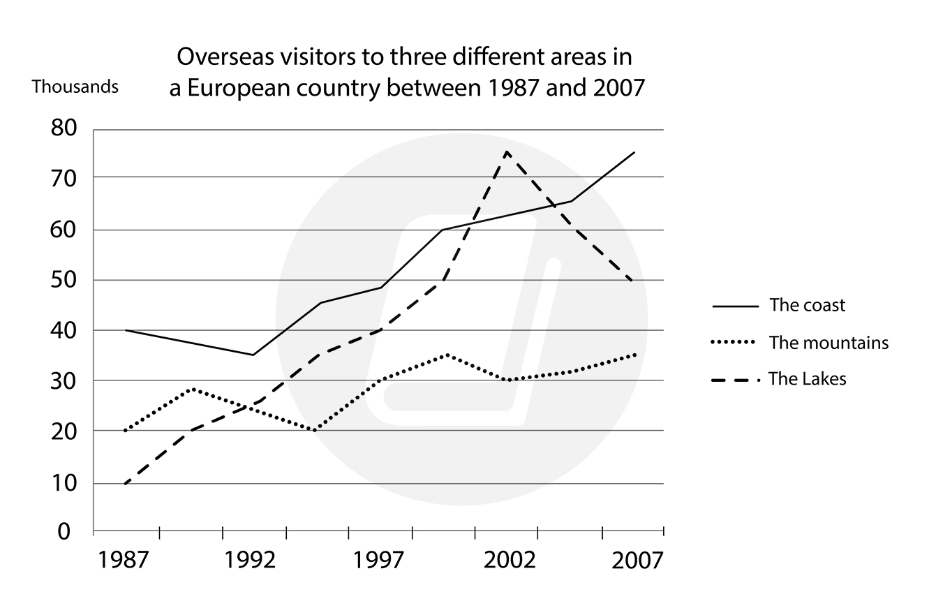
The graph below shows the number of overseas visitors to three different areas in a European country between 1987 and 2007.
The given chart compares data on foreign visitors, in number, to three areas: the coast, the mountains, and the lakes in a European country from 1987 to 2007.
Overall, all of the three areas witnessed rises during the given period. While the number of overseas tourists to the coast remained the highest, that to the lakes fluctuated significantly.
In 1987, the coastal areas were the most-visited attractions for foreigners with 40,000 tourists. In contrast, the mountains gained only 20,000 visitors outside the given country. The figures for the lakes are even lower by a half of that, of 10,000 visitors.
In 2007, the coastal areas remained the highest in the number of overseas visitors with a figure of 75,000, despite some slight drops over the given period of time. In comparison, the mountains ended up with only 50,000 foreign tourists although it witnessed a remarkable resurgence to 75,000 in 2002. The figure of the lakes changed continuously over time and finally stayed at the lowest, at roughly 35,000, in 2007.
(177 words)
Summarise the information by selecting and reporting the main features and make comparisons where relevant.
The given chart compares data on foreign visitors, in number, to three areas: the coast, the mountains, and the lakes in a European country from 1987 to 2007.
Overall, all of the three areas witnessed rises during the given period. While the number of overseas tourists to the coast remained the highest, that to the lakes fluctuated significantly.
In 1987, the coastal areas were the most-visited attractions for foreigners with 40,000 tourists. In contrast, the mountains gained only 20,000 visitors outside the given country. The figures for the lakes are even lower by a half of that, of 10,000 visitors.
In 2007, the coastal areas remained the highest in the number of overseas visitors with a figure of 75,000, despite some slight drops over the given period of time. In comparison, the mountains ended up with only 50,000 foreign tourists although it witnessed a remarkable resurgence to 75,000 in 2002. The figure of the lakes changed continuously over time and finally stayed at the lowest, at roughly 35,000, in 2007.
(177 words)

2.jpg
