Please check my writing! Million thanks!
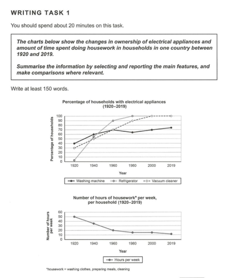
The line charts illustrate the alteration in the possession of electric appliances and the quantity of time spent on housework in family in one nation from 1920 to 2019.
It is clear that the percentages of households with electrical devices, namely washing machines, refrigerators, and vacuum cleaners, saw upward trends in the time survey, while the number of hours of housework per week, per household, saw an opposite tendency during the research period.
Initially, in 1920, the rate of families owning washing machines made up highest, stood at 40%, whereas the figure for vacuum cleaners was slightly lower, at 30%, compared to almost no refrigerator-owning households. After about 100 years, in 2019, there were significant rises of roughly 100% and 70% to both 100% in the ratios of owning refrigerators and vacuum cleaners in households. Meanwhile, the rate of the possession of washing machines also saw a rapid increase to roughly 75%.
However, the amount of time expenditure on housework weekly per family experienced a dramatic fall. To specify, in 1920, an average family needed 50 hours each week to do housework, while up to 2019, they just spent medium 10 hours on housework in a week.
SUMMARISE THE INFORMATION FROM THE GRAPHS
The line charts illustrate the alteration in the possession of electric appliances and the quantity of time spent on housework in family in one nation from 1920 to 2019.
It is clear that the percentages of households with electrical devices, namely washing machines, refrigerators, and vacuum cleaners, saw upward trends in the time survey, while the number of hours of housework per week, per household, saw an opposite tendency during the research period.
Initially, in 1920, the rate of families owning washing machines made up highest, stood at 40%, whereas the figure for vacuum cleaners was slightly lower, at 30%, compared to almost no refrigerator-owning households. After about 100 years, in 2019, there were significant rises of roughly 100% and 70% to both 100% in the ratios of owning refrigerators and vacuum cleaners in households. Meanwhile, the rate of the possession of washing machines also saw a rapid increase to roughly 75%.
However, the amount of time expenditure on housework weekly per family experienced a dramatic fall. To specify, in 1920, an average family needed 50 hours each week to do housework, while up to 2019, they just spent medium 10 hours on housework in a week.

writingtask1cam1.jpg
