[Hi everyone, I am a new member. I would highly appreciate if you all fix and grade this essay for me. My target is 6.5 writing, so hopefully I can get it! Thanks for all]
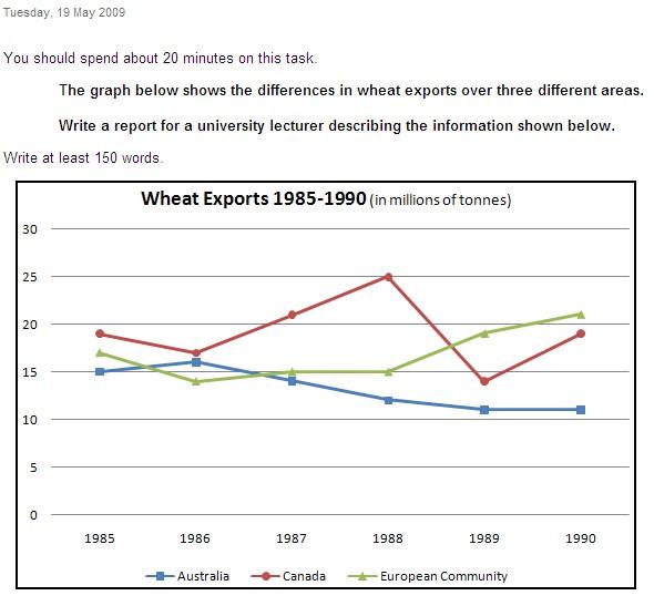
The given line chart illustrates how much wheat was sold overseas in 3 specific zones over the course of 5 years starting in 1985 and measured in millions of tonnes
As can be observed from the chart, it is clearly evident that the patterns of these areas had considerably fluctuations over the time frame shown. While the amount of wheat sent abroad witnessed a downward trend in Australia, that of European Community tended to increase and the exportation of wheat in Canada significantly oscillated throughout the studied period.
In 1985, the amount of wheat exported in Canada registered the highest of 3 regions, standing at about 19 millions of tonnes. The exportation of European and Australia was lower of roughly 17 and exactly 15 millions of tonnes respectively. The year 1988 experienced a second highest hit in the amount of wheat sent overseas in Canada, peaking at 25 million tonnes, before hitting the bottom of around 14 million tonnes in the following year. At the same time, a reserve tendency could be witnessed in European which had dramatically jumped from 15 to over 20 million tonnes by 1990.
With regards to the amount of wheat sold overseas in Australia, it increased slightly to approximately 16 million tonnes in 1986. This figure had steadily fallen by 5 million tonnes by 1990. In contrast, there was an upward trend in the export of Canada, closely 20 million tonnes at the similar time.

IELTSWritingTask1.jpg
