Hi,
I have just started on learning ielst. Please help to correct my first writing. Tks you so much.
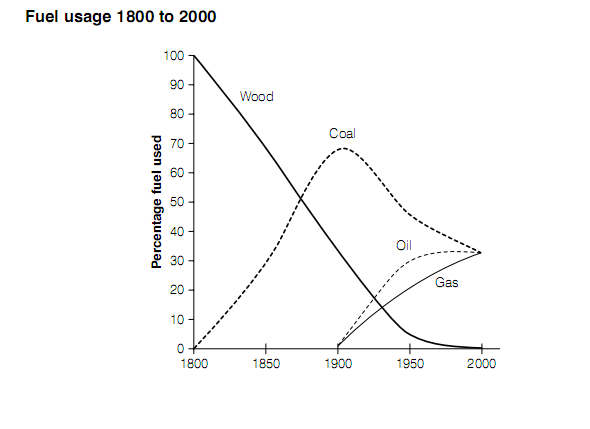
The graph shows the percentage of four different types of fuels in use between the years 1800 and 2000.
Summarize the information by describing the main features of the graph and making comparisons where appropriate.
Writing:
The chart shows the use of wood, coal, oil and gas between 1800 and 2000.
Starting at 1800, wood was only fuel then it was used by everyone. In 1850, percentage of wood used dropped dramatically to approximately 65% because the second type of fuel - coal was invented. Percentage of coal used increased sharply to 30% after 50 years in 1850 and reached the peak in 1900 with vicinity of 70% people used.
Since 1900s, human had more type of fuels to select. Coal dropped slightly but it was used by 40% people. Follow coal were oil and gas. Wood was only used by around 3% people.
In 2000, it seemed that no one selected wood as fuel. Meanwhile, oil and gas became more popular with 30% for each. Coal continued drop and reach the same point with oil and gas.
Fuel is always importance in our life. But the behavior in using fuel was changed by time since we had more options and able to pick the fittest one.

09012013_174914..png
