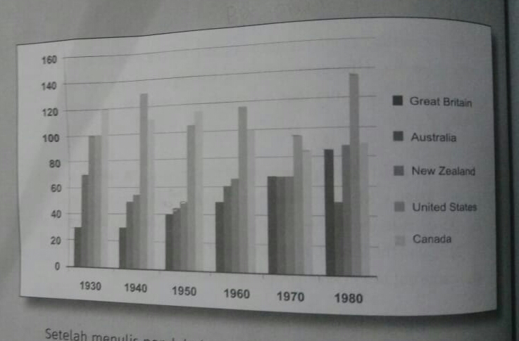
the figures for imprisonment in five countries
The bar chart below illustrates diagram for imprisonment over a period of 50 years in five different areas.
It is clear that the greatest number of prisoners between 1930 1nd 1980 is United States. We can also see quantities for imprisonment in five countries trend to rise by every 10 years period.
In each of decade shown on the chart amount of prisoners in America increase except in 1950 and 1970. Roughly a rise 10000 to 40000 of prisoners reported in US from 1930 to 1980. Meanwhile, in Great Britain number for imprisonment always grows reached 85000 in 1980.
In the year 1970, the figures of imprisonment are almost same in three countries. They are Great Britain, Australia and New Zealand. Before 1970, the fluctuation numbers of these three countries. In the year 1980, the diagram for prisoners relatively surge in Great Britain and New Zealand. In other hand, Canadian prisoners decline between 1930 and 1980.

IMG20180910WA0005.jpg
