IELTS WRITING TASK 1 - PARCELS DELIVERED BY FedEx and TNT MAIL SERVICES
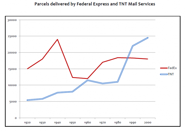
The line chart compares the data of package delivery distributed by two delivery service companies between 1920 and 2000. Overall, it is noticeable that both lines experience an upward trend. However, although FedEx was the most popular mail service at first, it was replaced by TNT through the end of the survey.
In the first year, the highest came to FedEx with 15.000 parcels while TNT only a quarter of it. Both companies then experienced a growth in the following twenty years, yet the gap between FedEx and TNT have widened. Conversely, the former plummeted tremendously to approximately 120.000 while the latter saw a slight surge to 80.000 in 1950. Such gap then narrowed down and both figures nearly reached the same level in 1960.
Afterw which, FedEx proportion saw a significant rise over the next 20 years before dipping steadily over the last given period. In contrast, the number of TNT parcels decrease minimally then the figure rocketed dramatically and reached a peak by 24.000 after overtaking the first position from its competitor.
FedEx vs TNT MAIL SERVICES
The line chart compares the data of package delivery distributed by two delivery service companies between 1920 and 2000. Overall, it is noticeable that both lines experience an upward trend. However, although FedEx was the most popular mail service at first, it was replaced by TNT through the end of the survey.
In the first year, the highest came to FedEx with 15.000 parcels while TNT only a quarter of it. Both companies then experienced a growth in the following twenty years, yet the gap between FedEx and TNT have widened. Conversely, the former plummeted tremendously to approximately 120.000 while the latter saw a slight surge to 80.000 in 1950. Such gap then narrowed down and both figures nearly reached the same level in 1960.
Afterw which, FedEx proportion saw a significant rise over the next 20 years before dipping steadily over the last given period. In contrast, the number of TNT parcels decrease minimally then the figure rocketed dramatically and reached a peak by 24.000 after overtaking the first position from its competitor.

FedExTNT_0.png
