Unanswered [1] | Urgent [0]
  

Home / Writing Feedback   % width   Posts: 2


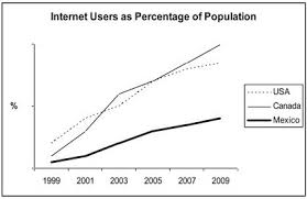
The line chart below shows the percentage of Internet users in 3 countries from 1999 to 2009


ngockhanh1811 1 / -  
Mar 22, 2021   #1

internet users numbers


The given graph compares the proportion of people that used the Internet in three different countries over a 10-year period, between 1999 and 2009.
Overall, it is obvious that the percentage of Internet users in each country broke away. However, the number of people who accessed the Internet in Mexico was by far the lowest over the time shown.

In 1999, the figures for Internet usage in the USA was around 20%, which was the highest point of 3 countries. The percentage in Canada and Mexico were lower, at about 10% and 5% respectively. Over the next six years, there was an enormous difference between the USA, Canada, and Mexico. The figures for the USA and Canada were at 70%, which were approximately three-fold compared to the percentage in Mexico.

In 2009, almost all people in Canada accessed the Internet, while the number of population that used the Internet in the USA was around 80%. In sharp contrast to it, just over 40% of people in Mexico accessed the Internet.

  • download.jpg


Holt  Educational Consultant - / 15384  
Mar 22, 2021   #2
The given graph

- What kind of graph? Be specific. The reader cannot see the image. Show your familiarity with the different kinds of measurement images by properly identifying the graph. It is a bar graph? A line graph? What?

in three different countries

- Which are? You have to specify the countries as a part of the summarized information. These will help the reader understand what upcoming discussion information should be noted. These are the information that your report will actually focus on, so informing the reader beforehand will be helpful to your score.

broke away

- What do you mean? This can be either a positive or negative depending upon how you structure the sentence. The information in that presentation is incomplete. Tell the reader how the information broke away.

Good work on the estimation of percentages between Mexico and Canada. You showed that you analyzed the information and considered the possible measurement ranges for both countries.

were approximately three-fold

- An estimation of the threefold digits would have helped deliver more specific information to the reader who, at this point, has no idea what the threefold measurement might be.


Home / Writing Feedback / The line chart below shows the percentage of Internet users in 3 countries from 1999 to 2009
Do You Need
Academic Writing
or Editing Help?
Fill out one of these forms:

Graduate Writing / Editing:
GraduateWriter form ◳

Best Essay Service:
CustomPapers form ◳

Excellence in Editing:
Rose Editing ◳

AI-Paper Rewriting:
Robot Rewrite ◳

Academic AI Writer:
Custom AI Writer ◳