Summarize the information by selecting and reporting the main features, and make comparisons where relevant.
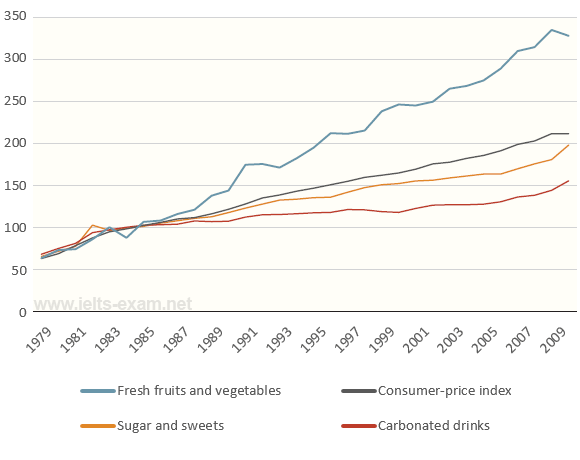
The line chart provides information about the changes in price of different food groups in the USA from 1979 to 2009, and the overall trend in the consumer-price index. Overall, it is clear that the period witnessed a general increase in the 3 food group products, despite minor fluctuations. Among the food commodity groups, only fresh fruits and vegetables showed a more significant rise in price than that of the overall index and other given food types.
Starting at the same point as the overall index at over 50 in 1979, the figure for fresh fruits and vegetable crops' price slightly varied over the 30-year period. The fruits and vegetables' price nearly remained the same as the consumer index's for the first 6 years before starting increase rapidly during the remainder of the time, reaching its highest value in 2009, at over 300.
The corresponding figures for sugary products and carbonated drinks, despite being similar to the previous group in terms of an upward trend, showed a less volatile data. Throughtout the years, both food groups' prices gradually increase, hitting their final higest point in 2009. Peaking at exactly 200, the cost of sweets and sugars was higher than the figure for carbonated drinks- just over 150- at the end of the period.
Hope to see your feedbacks. Thank you!

IELTS_Writing_Task_1.png
