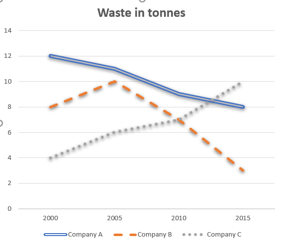
the amount of waste from three companies
The line graph compares how much waste was produced by three companies from 2000 to 2015.
The initial impression from the chart is that the amount of waste from Company A and B saw a significant decrease throughout the 15 - year period, while there was a dramatic increase in that from Company C. Another striking feature is that the figure for Company C experienced a slight rise before dropping rapidly.
The amount of waste from Company A stood at 12 tonnes in 2000, followed by a significant decrease of 4 tonnes of waste after 15 years. In contrast, the figure for Company C saw the opposite trend over the years. In the first year, approximately 4 tonnes of waste was produced from Company C, and then the figure experienced a considerable upward trend to 10 tonnes in 2015.
In addition, starting with 8 tonnes of waste in 2000, the figure for Company B reached the highest point of 10 tonnes over 5 years, but later dropped sharply to around 3 tonnes of waste in 2015, a remarkable decrease of about 7 tonnes in 10 years. Company B marked the lowest amount of waste in three companies in the last examined year.
Thanks for your feedback very much!

bivit1.png
