Hi all, i'm new in this forum and i have a problem in IELTS writing tasks and i think this section is the hardest part in an IELTS exam.
This is my Writing task 1 question. i know that this question had been discussed before but the thread was already closed.
and this is my answer..
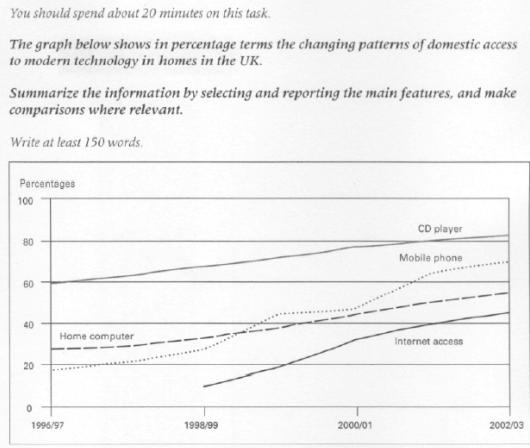
The line graph compares the proportion of households access to three different electronic appliances and the Internet over a period of 7 years in the UK.
It can be clearly seen that households who had access to electronic gadgets and internet in the UK homes rose steadily over the period shown and CD player accounted for the largest percentage. We can also see that the Internet was not accessible for domestic until 1998/99.
In 1996/97, around 60% of all UK households had CD player and the figures for home computer and mobile phone stood around 27% and 20% respectively. In 1998/99, when the Internet was available in the UK homes, approximately one tenth of the UK homes gained access to it.
By 2002/03, the domestic access to CD player had reached over 80%, mobile phone access had risen to about 70% of the households. At the same time, the availability of access for home computer increased by nearly 20%, whilst for the Internet jumped to by around 28%.
i had a little problem in sentences when i wanted to compare the mobile phone take over the home computer. Does anyone have suggestions? especially for paragraphs and sentences organizations? Many thanks in advance for those who want to help.

Problem

