Unanswered [1]
  

Home / Writing Feedback   % width   Posts: 4


The line graph illustrates the amount of people who bought music over seven years time frame


Mrshangaung 1 / -  
Sep 18, 2021   #1

The graph below shows how people buy music


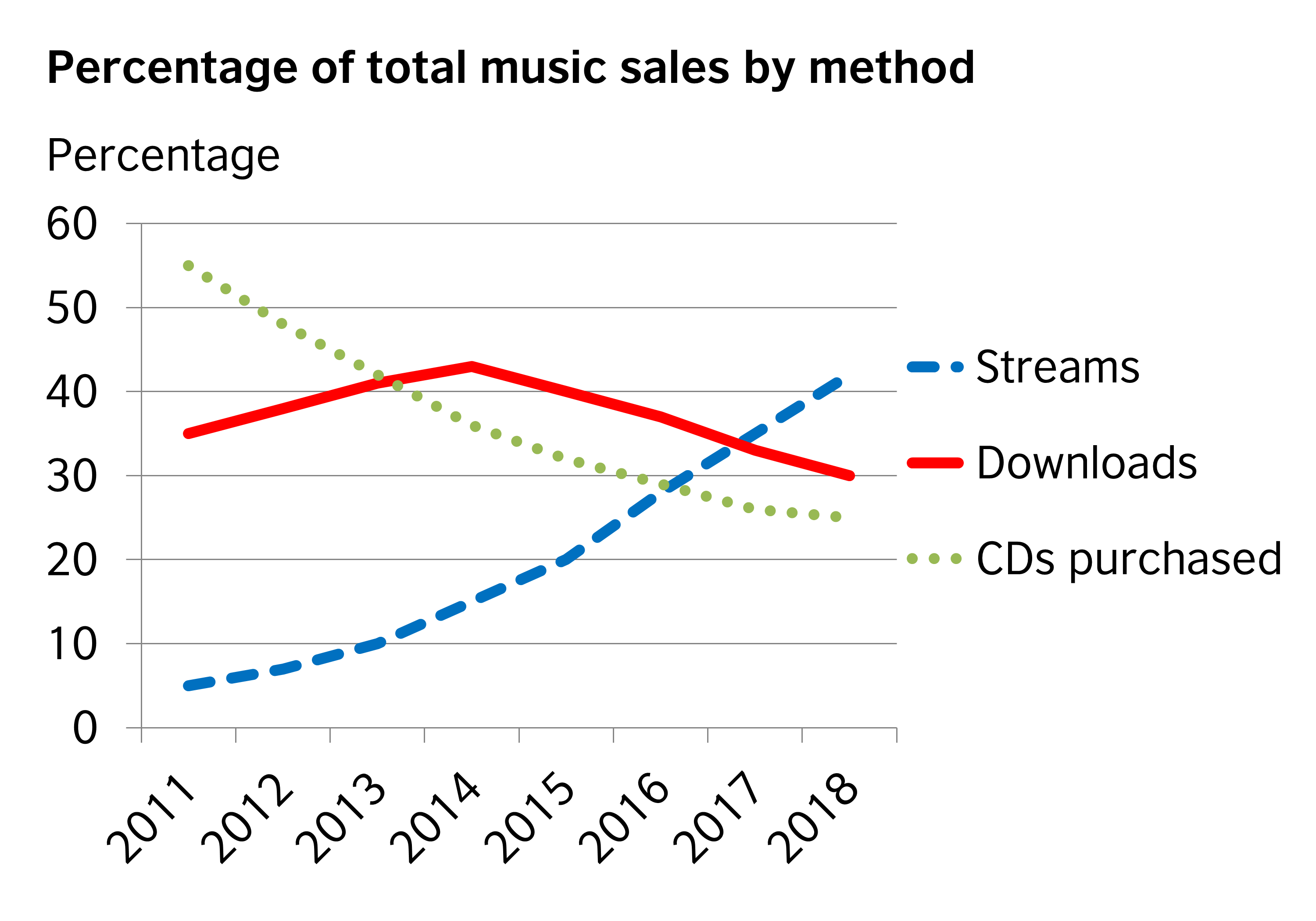
The line graph illustrates the amount of people who buy music from 2011 to 2018. Generally, music sold on streams significant rose all over the period whereas people who purchased by CDs were declining steadily. People who bought music by downloading method went up at first before decreasing until 2018.

First of all, selling music by streams stood at approximately 5 percent in 2011 followed by a steady increase which overtook the other two ways in 2016 and 2017 before reaching to just over 40 in 2018. The amount of CDs purchased began at roughly 55 then it reduced noticeably to the lowest point which is about 25 in 2018.

Secondly, the number of downloads climbed gradually in the beginning until 2014 when it reached the peak point of on average about just over 40 before jumping suddenly to 30 percent in 2018.

To conclude, streaming is the most popular way to sell music as most people buy it in streams whereas selling by CDs is the least.

  • WritingB2Asummary.png


Holt  Educational Consultant - / 15461  
Sep 19, 2021   #2
The writer was doing a good job of representing percentages, but then stopped referring to alternate words for percentage. This left the reader confused and wondering if percentages were still being discussed. continued use of synonyms for the key measurement reference was needed for good scores in the LR, C + C, and G R A sections. Always refer to keywords in various ways.

Each paragraph is a very busy run-on presentation. Kindly use 3-5 sentences in 3 paragraphs to properly meet the paragraph format considerations. These rushed sentence presentations lower the C + C section even further due to the lack of explanation development and clarity.

A task 1 essay need not be concluded. This is a report, not an opinion essay.
paleodietcorner 2 / 4  
Sep 20, 2021   #3
@Holt actually examined your writing enough so I will only provide some considerable advices.

At the second paragraph, you wrote CDs purchased decreased negligibly. It doesn't make sense since it dropped by merely a half from the peak. The more proper word should be dramatically.

Also, it seems hard not only to you, but also to me when you divided 2 bodies regarding 3 products. I mean, doesn't it became easier when u distribute it in terms of two periods of time? You can make comparisons, which does not appear in your writing, such as when the downloads equal CDs purchased in 2013 and the streams dominate CDs in 2016.

These are two advices that I could suggest you. Hope u this read carefully.

Cheers,
papcaii 4 / 7  
Sep 20, 2021   #4
i think a conclusion is unnecessary in WR task 1. instead of that you should write one more sentence in your overview, which will help readers imagine more easily what you're gonna indicate in the body. btw, u can try use "reached the record high of" since the word "peak" is pretty common, that may somehow increase your LR score, i think :))


Home / Writing Feedback / The line graph illustrates the amount of people who bought music over seven years time frame
ⓘ Need Writing or Editing Help?
Fill out one of these forms for professional help:

Best Writing Service:
CustomPapers form ◳

Graduate Writing / Editing:
GraduateWriter form ◳

Excellence in Editing:
Rose Editing ◳

AI-Paper Rewriting:
Robot Rewrite ◳