the analysis of Australian exports numbers
I'm very grateful if you repair my mistakes because my normal scores are 4.0 - 4.5 and my score's in this essay . Thanks a lot for your help!
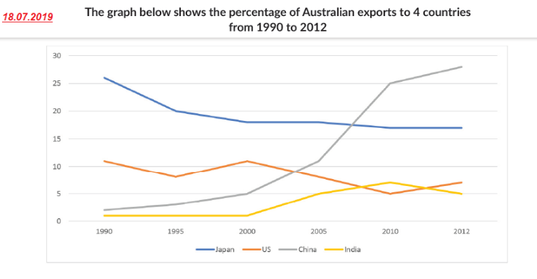
TOPIC: The graph below shows the percentage of Australian exports to 4 countries from 1990 to 2012
The line graph offers insights into how many percentages was exported to 4 distinct nations namely Japan, US, China and India by Australian in the period of 22 years (from 1990 to 2012).
Mostly strikingly, over the period from 1990 to 2012 while the figures for Japan and US had downward trends, the opposite was true for China and India. In addition, the period from 2000 to 2012 experienced a significant fluctuation in the figures for all.
In 1990, the proportion of US was merely 12%,after a decade, the figure reached the same level as it was 1990, although it had a noticeable decrease in 1995. At that time in 1990, the products of Japan was ranked at the first place, 26%, before declining substantially to 17% in 2000. In the next 12 years, the figure for the former reached the lowest point in whole line graph in 2010, 5%, which was followed by a moderately increase of about 7%. Moreover, the figure for the later was threefold as high as the former was, ultimately.
Between 1990 and 2000, the percentage of imported products in India remained constant, while that for China inclined moderately before surging overtaking Japan as the most common imports about 28% in 2012. The trend of India was an remarkable increase, but this figure made up one - fifth the figure for the fomer, eventually.

writask11807.png
