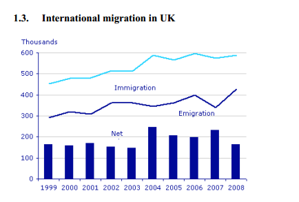
Some interesting facts concerning about immigration, emigration and net immigration in UK from 1999 to 2008 were illustrated by this line graph above.
Overview, there were some fluctuations for each of them, but both immigration rate and emigration rate tend to increase over the period shown.
The proportion which is the number of immigration was higher than the others. From 1999 to 2003 this rate was a slightly raised, and before reaching the highest point at 600000 peoples in 2006, this rate fluctuated widely from 2003 to 2005, and it continued fluctuating until 2008
Moving to the second highest proportion, the number of people who emigrated was a significantly increased from 1999 to 2005 by 400000 peoples. In 2006, this rate decreased suddenly, but then it continued having an upward trend from 2007 to 2008.
Finally, let's look at the number of net immigration in UK, this rate peaked at almost 250000 people in 2004 and 2007 though having some slightly fluctuation.

Untitledd.png
