Summarise the information from the graph
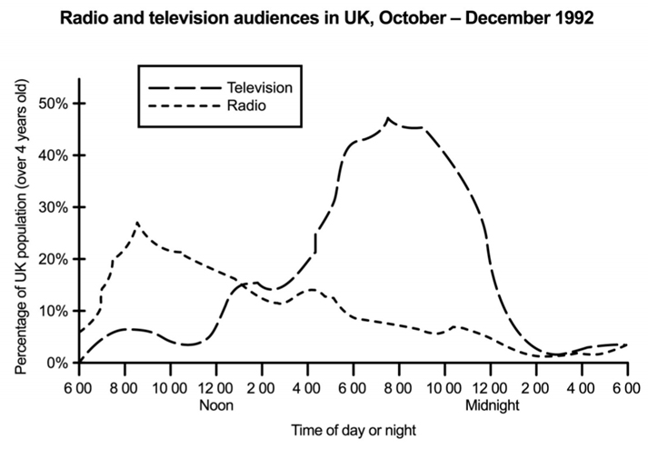
The graph below shows radio and television audiences throughout the day in 1992. Summarise the information by selecting and reporting the main features, and make comparisons where relevant.
The line graph compares the differences on the proportion of British people watching TV and listening to the radio in one day over the last 3 months in 1992.
It is clear that more people prefers radio in the morning while many of them spent the evening watching TV. Also, the number of TV viewers are higher than those listening to the radio over the 24-hour period.
In the morning, around 8% of British population started their morning by listening to the radio but none of them choose to watch TV. Over the next 5 hours, the percentage of radio audiences reached a peak of nearly 30% at 9 a.m. and fall steadily from that time whereas the figures for TV viewers remained below 10%.
From 1 p.m., the number of British watching TV significantly rose to approximately at 45% between 8 p.m. to 9 p.m., over 4 times higher than radio listeners at that time. However, both the proportions of radio and TV audiences remained relatively low under 10% by midnight.

18f709a0d96811e9a.jpg
