Unanswered [6] | Urgent [0]
  

Home / Writing Feedback   % width   Posts: 3


The line graph represented how many units of electricity generated from three primary energy sources


tomfromasia 1 / 1  
Jul 1, 2021   #1

electricity produced from 3 energy sources


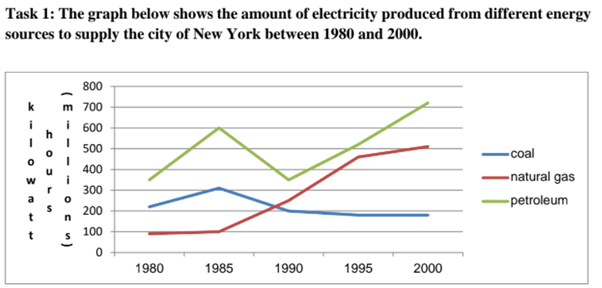
The line graph represented how many units of electricity generated from 3 primary energy: coal, natural gas, and petroleum for New York City from 1980 to 2000. The most prominent feature of the diagram is that coal's role narrowed to electricity production, whilst there was an upward trend in the energy output produced from the others during the period.

Having climbed substantially to reach 600 million kW hours in 1985, petroleum as an energy source witnessed a trend reversal in the next 5 years, followed by an astonishing recovery to hit a peak at around 700 million kW hours in the last period. Although the electricity production from natural gas static at 100 million kW hours until 1885, it surged to a high of 450 units by 1995, then moderately grew to 500 kW hours in 2000.

As for coal-produced-of-energy, the figure was observed an identical trend to petroleum's one, which soared to around 300 million kW hours in 1885 and reversed until 1990. However, there was a stagnation at approximately 200 million units of electricity until the end of 2000.

  • chartielts1.png


Holt  Educational Consultant - / 15388  
Jul 2, 2021   #2
The proper reference is "The line graph represented the kilowatt hours used by the millions..." rather than, " how many units of electricity " as that is not an informative reference that adds to the important summary points of the paragraph. That point of correction does not take away from the informative nature of the succeeding sentences in the summary paragraph.

In the second paragraph, the base or starting measurement should be indicated to lie the increase to a baseline, as all measurements of this nature requires. The graph also indicates an equal measure reference to coal and natural gas in 1990 which was overlooked in the analysis presentation. There is limited numerical data shared in the overall discussion that made the essay questionable to the reader. It lacks in information that would've been helpful in keeping the reader informed based on the image presentation.
OP tomfromasia 1 / 1  
Jul 2, 2021   #3
@Holt Thank you for your detailed and informative comment. I greatly appreciate it.


Home / Writing Feedback / The line graph represented how many units of electricity generated from three primary energy sources
Need Writing or Editing Help?
Fill out one of these forms:

Graduate Writing / Editing:
GraduateWriter form ◳

Best Essay Service:
CustomPapers form ◳

Excellence in Editing:
Rose Editing ◳

AI-Paper Rewriting:
Robot Rewrite ◳

Academic AI Writer:
Custom AI Writer ◳