Unanswered [2] | Urgent [0]
  

Home / Writing Feedback   % width   Posts: 4


IELTS WRITING TASK 1: The line graph shows the number of single-family homes in the United States...


kwuynh 1 / -  
Aug 13, 2021   #1

American single-family houses


TOPIC:
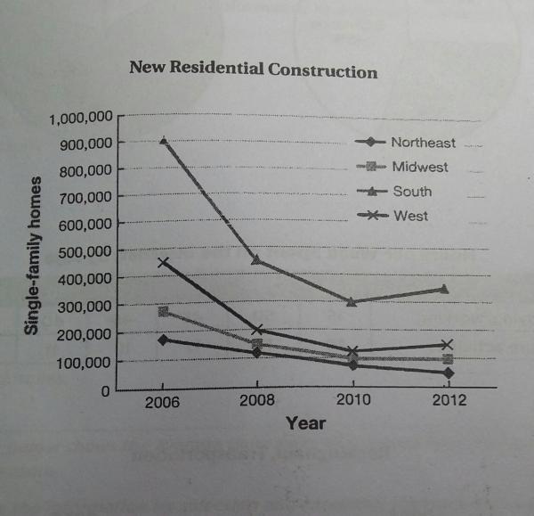
The line graph below shows the number of single-family homes constructed in the United States by region over a period of six years.
Summarize the information by selecting and reporting in the main features, and make comparisons where relevant.

Answer:
The provided graph gives comparative data about how many American single-family houses were built in four different areas over the course of six years starting from 2006.

A glance at the graph reveals that a significant majority of the residential constructions were in the South region, but the reverse was the case for the Northeast area. It can also be observed that most houses were built in 2006, however, all four regions witnessed a notable decline after that.

Since 2006, the South remained to be the region with most houses constructed. Over the next four years, it experienced a dramatic collapse before reaching the nadir in 2010, which was followed by a slight increase to roughly 350,000 homes two years later. On the contrary, a steady downward tendency was recorded in the Northeast region, which hit the bottom-most point at well beneath 100,000 houses in 2012.

A similar pattern can be seen for the remaining two areas. After a brief peak, the numbers in the West and Midwest regions dropped to approximately 200,000 in 2008 and continued to do so over the next two years. However, in comparison to the West, which witnessed a mild rise to about 150,000 constructions, the Midwest showed a stability in 2012.

  • 20170609_2123481.jp.jpg


Holt  Educational Consultant - / 15344  
Aug 14, 2021   #2
The comparisons presented do not cover an equal comparison of the 4 regions. The writer always does a complete analysis of the first region in the paragraph, then only skims the information and discussion for the second region. So the analyses and comparison , though quite wordy, is not really an academic analysis of the image provided.

Even though the writer has presented the correct information, there was still a lack of proofreading and editing of the content. The writer tried to use advanced English words that are specific to a particular field such as astronomy (nadir). While impressive the meaning of the word does not apply to this discussion. Expect LR deductions for other unrelated word usage.
Chau Anh Hoang 1 / 2  
Aug 14, 2021   #3
You should emphasize some peaks, bottoms and try to compare by dividing by year. Choose some specific figures that has a significant change and describe it as detailed as possible. The analysis and comparision here are quite wordy and not really academic.

You should focus on summarizing the informations from the graph for better coherence and cohension.
hahalolo 1 / 5  
Aug 21, 2021   #4
The phrase A glance at the graph reveals that sounds unnatural and informal in a Writing task 1 since it is overused by many English centre. You should replace it with phrases such as It is noticeable that.

Too formal and academic words like nadir (it experienced a dramatic collapse before reaching the nadir in 2010) are not expected in Writing task 1 also. I would use the lowest rate/point

As there is a same downward pattern in all regions from 2006 to 2010, you should describe the change between 2006 and 2010 in the first graph, and the remaining period in the second graph in order to stay coherent.


Home / Writing Feedback / IELTS WRITING TASK 1: The line graph shows the number of single-family homes in the United States...
Do You Need
Academic Writing
or Editing Help?
Need professional help with your assignments? Fill out one of these forms:

Graduate Writing / Editing:
GraduateWriter form ◳

Best Essay Service:
CustomPapers form ◳

Excellence in Editing:
Rose Editing ◳

AI-Paper Rewriting:
Robot Rewrite ◳