Unanswered [1] | Urgent [0]
  

Home / Writing Feedback   % width   Posts: 4


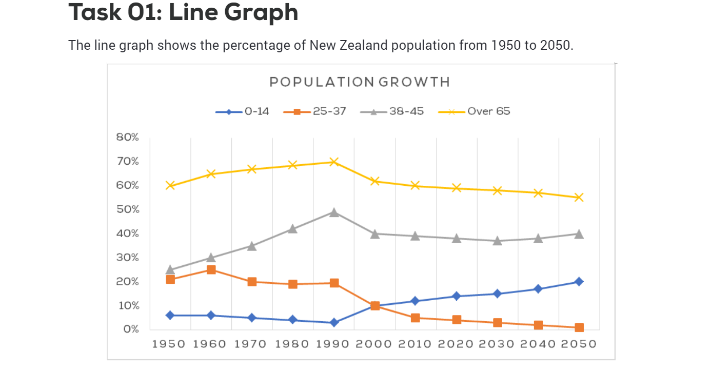
WRITING TASK 1 : The line graph shows the percentage of New Zealand population from 1950 to 2050


thanhtrang 1 / -  
Jun 10, 2021   #1

The line chart illustrates the New Zealand population growth pattern between 1950 and 2050.


It is clear that the percentage of the age group of both 0-14 and 38-45 witnessed the same trend of increasing, the opposite was true for the figure for the 25-37 and over 65 age group over the period. It is also notable that, the increase of the population 0-14 aged was the most significant.

In 1950 the figure for people 0-14 years old stood at 5% in comparison with over 20% of the 38-45 age group. Over the period of 40 years, the percentage of people aged around 38 and 45 rose dramatically to reach a peak of nearly 50%, which is expected to decrease slightly to just 40% in 2050. In contrast, despite a gradual drop of around 3% during the first 40 years, the figure for 0-14 aged population is predicted to increase sharply to 20% in the last year.

On the other hand, the proportion of people who were in the age between 25 and 37 and over 65 saw a downward trend. Starting at 60% in 1950, the percentage of people age over 65 increased marginally to 70% in 1990. However, in 2050, it is expected to fall substantially to 55% during the last year. Meanwhile, that of 25-37 years old fluctuated around 20% from 1950 to 1990, which is expected to fall to 0% at the end of the period.

  • Screenshot59.png


Holt  Educational Consultant - / 15384  
Jun 11, 2021   #2
growth pattern

A reference to decade on decade comparison s as shown in the chart gap years would have been a better way of putting the data into the summary form. A reference to the measurement type is also a good piece of information toinclude as a part of the information source / measurement particulars.

Your discussion based on a 40 year gap seems to wide and skips over important comparison points. I would like to specifically call your attention to the year 2000 when there is an overlapping measurement for 0 -14 and 25-37. That is highlight that should have been analyzed for the "analyze and make comparisons where relevant " part of the report.
Harinn 2 / 4  
Jun 14, 2021   #3
For the body 1, you should describe about the grey line and the orange one, which have the same beginning but different trends.
In the body 2, the yellow and blue line should be illustrated due to their conversely trends.
niesaysi 16 / 281  
Jun 14, 2021   #4
growth pattern between 1950 and 2050.

"From 1950 to 2050" is different from "between 1950 and 2050." In other words, "between...and" and "from...to" should not be used interchangeably. Based on the graph, you are supposed to illustrate the percentage of New Zealand population from 1950 to 2050.


Home / Writing Feedback / WRITING TASK 1 : The line graph shows the percentage of New Zealand population from 1950 to 2050
Do You Need
Academic Writing
or Editing Help?
Fill out one of these forms:

Graduate Writing / Editing:
GraduateWriter form ◳

Best Essay Service:
CustomPapers form ◳

Excellence in Editing:
Rose Editing ◳

AI-Paper Rewriting:
Robot Rewrite ◳

Academic AI Writer:
Custom AI Writer ◳