[IELTS - TASK 1] The line graph of tourists to Scotland.
tourists in scotland who visited four different attractions
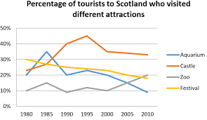
The line graph below shows the percentage of tourists to Scotland who visited four different attractions in Edinburgh.
Summarize the information by selecting and reporting the main features, and make comparisons where relevant.The line graph indicates the proportion of tourists who visited 4 different destinations in Edinburgh over the period of 30 years from 1980 to 2010.
Overall, the number of travelers enjoying Castle made up for nearly a half of the total during the survey's years. While the figure of Aquarium was relatively modest.
In 1980, the percentage of tourists going to the zoo was only 10%. After that, undergoing a few minor fluctuations, it increased significantly to 20% at the end of the period. By comparison, the Aquarium's tourist rate was higher 10% than that of the zoo in 1980 and reached its peak quickly only after 5 years before dropping dramatically and became the least popular attraction in 2010. The change in Castle's tourists percentage was similar to Aquarium's one. Reaching the highest point of the chart in 1995 with 45% and then it decreased gradually to more than 15% in the last year of the survey. Finally, the trend of visitors coming to the Festival dropped steadily through 30 years. It showed the commonness of Edinburgh's festival reduced more and more.
1.png
Holt Educational Consultant - / 15393 The formatting for this essay should follow the 3 paragraph format covering:
Par. 1: Summary overview + Trending statement
Par. 2: Comparison for Aquarium and Castle
Par. 3: Comparison for Zoo and Festival
It should not be presented in such a compressed paragraphical form. There are only 2 full formats to be used in the task 1 essay. The 4 paragraph format for the 2 image comparisons and the 3 paragraph format for the single image presentation. The exam taker should properly identify which format to use for the particular image presentations.
Complete the summary overview by always including the enumeration of comparison points and measurement indicators. These are necessary for the trending presentation which requires these notes for clear comparison presentations with regards to the highs and lows of the information content.
Based on the content, the writer knew how to properly compare data presentations. He just needs to be more conscious of how he presents the information to the reader / examiner, who will look for clarity and cohesiveness through paragraph separations.
All things considered though, the comparison presentation has good content and presentation considerations. It is the formatting requirement and incomplete summary overview that will limit the scoring consideration for the essay.
Lemme help you with some of your mistakes:
made up for nearly a half of the total ... While the figure of the Aquarium ...
I have some advices for you:
- reached its peak quickly only after 5 years before dropping dramatically and became the least popular attraction in 2010. Add the data of reached its peak and the least popular attraction at how much. Like reached its peak at around 45%
- It showed the commonness of Edinburgh's festival reduced more and more. => It showed the commonness of Edinburgh's festival reduced more and more. No need conclusion in writing task 1
Need Writing or Editing Help?