Unanswered [1] | Urgent [0]
  

Home / Writing Feedback   % width   Posts: 4


The Line graphs of how much people in UK and US to spend on Petrol


Diazalichsan 3 / 6  
Jan 5, 2017   #1

petrol expense of citizen in the USA and UK


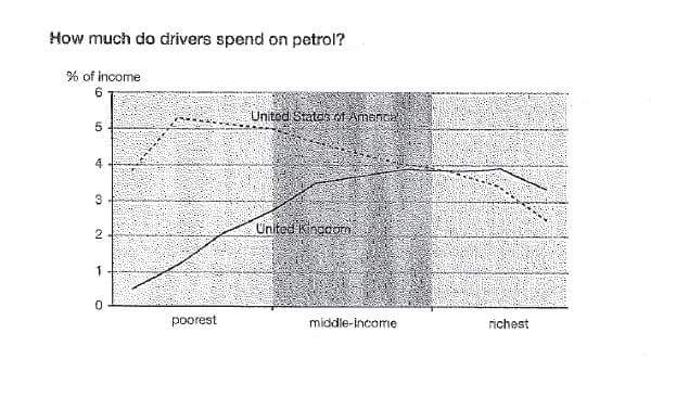
The line graph informs the percentage of petrol expense of citizen in United States and United Kingdom in three categories of people. Overall, it can be seen that people between middle income and rich on both countries have equal number of expense in Petrol.

Looking at the figures, the poor people in United States and United Kingdom have different percentage of expense in Petrol. The poorest in Unites States spent about 4-6% of their income on the petrol, while the people in United Kingdom only use 0.5-2% of their income to buy gasoline. However, there was a gradual differences in the use of Petrol of the middle income people in United States, they spent around 5-4% of their income on Petrol. Conversely, the middle income people in United Kingdom experienced significant percentage than poor people, with 3-4% of their income to buy petrol.

Interestingly, the group of people between middle income and richest witnessed equal number of percentage in the use of Petrol for both countries. The two line met at 4% on the use of Petrol for both countries. On the end of the figures, the percentage of use of petrol for rich people in United States decreased significantly than middle group at around 2-3%. In contrast, with rich people in United Kingdom with 3-4%.

  • 268321_1_o.jpeg


Nuverte0452 5 / 24  
Jan 5, 2017   #2
I am just correcting some grammar error.

... people in the United Kingdom experience a gradual percentage increase in the usage of petrol , with 3-4% of their ...
krempetkov 13 / 27  
Jan 7, 2017   #3
First, I would change the word "Interestingly", you are not supposed to give your personal opinion.

Second, about your overview - it's always better to give additional information to the examiner. Describe the main movements and the most significant changes.

"The first graph increased gradually till 2011, before experiencing a dramatic decrease. In contrast, the second graph had been decreasing for the first 2 years, and then a significant increase was observed."

That is just an example, bit I think it presents a good way to write an overview

Now some grammatical suggestions:

have different - have a different

So many times, you have forgotten the defining article before the countries names

gradual difference
Holt  Educational Consultant - / 15385  
Feb 3, 2017   #4
Diaz, good work on presenting more than the minimum number of words in your essay. That said, you should have worked on separating the opening statement into at least 3 or 5 sentences instead of presenting such a long thread of information in a continuous line. It is always best to break down the information you are presenting into sentences so that the reader has a chance to really understand and keep track of the information that you are imparting. In the current form, the reader will tend to forget what he is reading about even before he finishes reading the complete paragraph. When you have more sentences in a paragraph, you have a good chance of creating more advanced to complex sentence structures that can increase your grammar accuracy score and also help to increase your task accuracy range because you will show a better understanding of the illustration provided to you as you get to explain more about what you understand than just the obvious data presented.


Home / Writing Feedback / The Line graphs of how much people in UK and US to spend on Petrol
Do You Need
Academic Writing
or Editing Help?
Fill out one of these forms:

Graduate Writing / Editing:
GraduateWriter form ◳

Best Essay Service:
CustomPapers form ◳

Excellence in Editing:
Rose Editing ◳

AI-Paper Rewriting:
Robot Rewrite ◳

Academic AI Writer:
Custom AI Writer ◳