The bar chart and the pie chart report
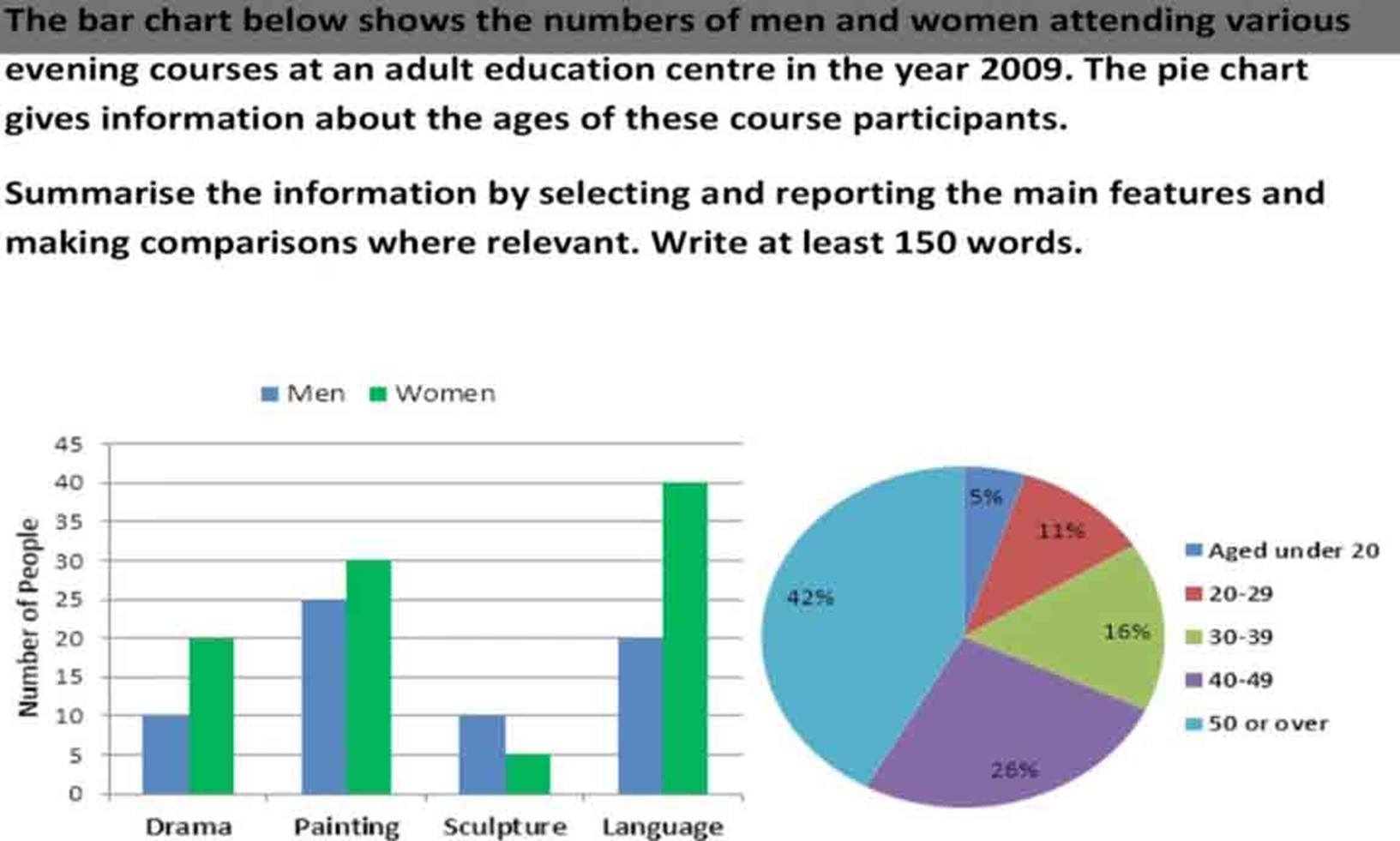
The bar chart illustrates the quantity of males and females who took part in different courses at an educational center while the pie chart provides information about the proportion of these participants according to five different age groups in 2009.
Overall, it is clear that the number of women involved in courses was higher than men, except sculpture courses. It is also noticeable that those aged 50 or over accounted for the highest attendance.
With regard to the bar chart, the highest figure belonged to attendance at language courses by women, with 40 people and half that number was for men. By contrast, just 5 females attended sculpture courses, which was twice as high as the figure for males. The number of women taking part in painting courses ranked second, with exactly 30 individuals, while the figure for men was about 25 people. Similarly, there were just 20 women and 10 men attending drama courses.
According to the pie chart, around 40% of people who are over 50 years old studied at this center, whereas just an eighth of that number was accounted by the under 20 age group. One in four attendances at courses belonged to those aged between 40-49 while the percentages of the 30-39 and 20-29 age groups were almost 15% and 10% respectively.

1.jpg
