Unanswered [2] | Urgent [0]
  

Home / Writing Feedback   % width   Posts: 3


IELTS 1 - MIX CHART women who were poverty-stricken & the poverty ratio in the USA


EdwardDowney 1 / -  
Mar 11, 2020   #1

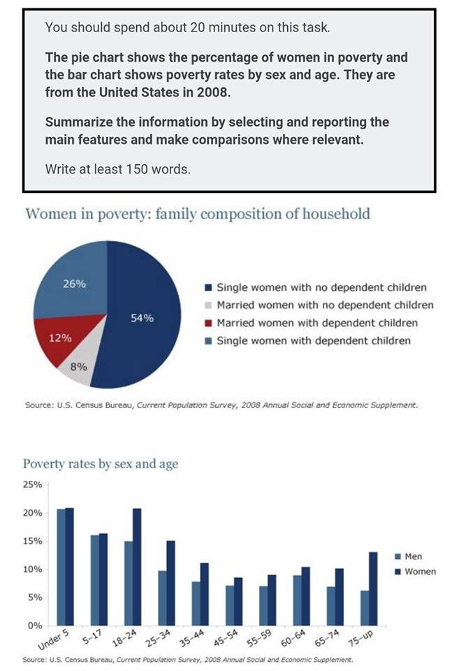
Women in poverty and percentage poverty rage by sex and age


The supplied pie chart shows the percentage of women who were poverty-stricken while the presented bar illustrates the poverty ratio according to gender and age group in USA in 2008.

Overall, women without children is comprised the largest proportion of the given pie chart. Furthermore, women, generally, had a higher poverty rate compares to man.

In the pie chart, it is remarkable that single women without children had the highest percentage of poverty rate while married women without any kids made up of the smallest one, at 54% and 8% respectively. Married women with dependent children and single women with kids accounted for remaining roughly two fifth.

In the bar chart, it is obvious that women was suffered poverty more than man regardless age group in the given year. Moreover, the age group "under 5" and"18-24" reached the peak at just over 20% while the lowest point was recorded at just under 10% among people who are "45 - 54".

Hello all. I'm a new member in this forums. I would like to say thanks to any one read this in advance. Really appreciated any comment below.

  • E1E5C02F7FA14D108.jpeg


potatowee 5 / 12  
Mar 11, 2020   #2
Hi there. I may have some suggestions for your essay here:
- I think a paragraph is comprised of 3-5 sentences so your paragraphing here may be lacking. You should add more to make a full paragraph. For example, you can add some information in the introduction and the overview. Here is my suggestion:

The pie chart and bar graph illustrates the poverty in the United States in 2008. The chart describes this situation based on the percentage of women in poverty-stricken households, whereas the graph provides a comprehensive classification according to gender and age group. Overall, women in the US had a higher risk of undergoing poverty compared to men, out of which single women bore the greatest burden.

- You are just merely describing the information, not comparing it. There are some ways you can make your description more concise and remain on point at the same time. Here, take this as an example:

"In the pie chart, it is ..."

Instead of recounting all the figures, I think you can use some linking words to make the contrast/similarities more prominent. For example:

In the pie chart, the percentage of single women suffering from poverty is significantly higher than their married counterparts, as they accounted for nearly three fourths of the whole female population in 2008. In comparison, married women with dependent children comprised for roughly 12%, whereas women who got married...

- I think that you can make some of the most prominent figures more present for the viewers here. For example, you can make more comparison regarding women in different age group here. Also, the percentage of poor men in the US appears to diminish when they get older, but this did not happen for women.
Holt  Educational Consultant - / 15385  
Mar 11, 2020   #3
You could have done a better job at representing the discussion of these charts. You only have 160 words presented. Just a little over the minimum word requirement. A fully developed Task 1 essay, the kind that can help you garner more ratings while being reviewed by an examiner, is approximately 175-190 words. As I reviewed your essay, I discovered that you were more focused on just presenting enough of the discussion to get things done. So you did not really try to do a comparison discussion in your presentation. The discussion presentation is what usually helps you achieve the 175 minimum word count. Next time, try to work on your analytics and comparisons more. The comparative discussion is what will boost your score. Don't settle for simply meeting the minimum requirement. That means you will be satisfied with a minimum score as well. Aim bigger and higher for a better score.


Home / Writing Feedback / IELTS 1 - MIX CHART women who were poverty-stricken & the poverty ratio in the USA
Need Writing or Editing Help?
Fill out one of these forms:

Graduate Writing / Editing:
GraduateWriter form ◳

Best Essay Service:
CustomPapers form ◳

Excellence in Editing:
Rose Editing ◳

AI-Paper Rewriting:
Robot Rewrite ◳

Academic AI Writer:
Custom AI Writer ◳