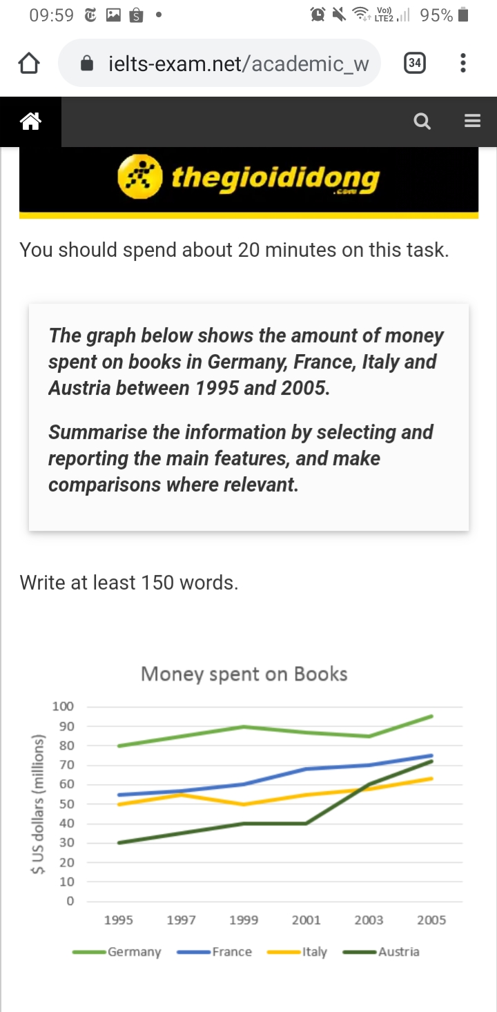
Spendings on books in some European countries
Answer:
The line graph compares the amount of money that people come from four separate countries paid for books in the period of 10 years from 1995 to 2005.
As can be seen from the chart, the year 1999 witnessed a steady increase by 10 million dollars of Germany and Austria and 5 million dollars of the figure of France, with the exception of Italy. From 1999, while only Germany changed direction to downwards trend before hit the highest point of 91 million dollars in 2005, Italy saw a recovery back and reached the peak at the point of approximately 61 million dollars at the end of the period.
The sequence of changes of France and Austria were by far positive. While France experienced a moderate going up until the end of the period, the figure of Austria remained at 40 million dollars for a year and then rocketed to 71 million dollars in 2005 before exceed Italy's in 2003.
In summary, remarkable changes of the paying for books of German, French and Austrian were seen during the period with the acceleration of Austrian's. Otherwise, the figure of Italy was more stable increase then the others.
(196 words- 22 minutes).
Thanks a million!!Can I get the image of the chart
@nhtan

Screenshot_20200525.jpg
Holt Educational Consultant - / 16009 The main problem that students have often comes with the Task 1 summary presentation. You, just like the others did not completely outline the information that was presented. You should have included a listing of the countries, the measurement type, measurement source (where indicated), and the trending statement. You presented a run-on sentence that doesn't really indicate all the required information. Instead, it offers only part of the information, without really offering an insight into the need to know these information beforehand. The summary is to be considered the outline of the upcoming information presentation. It tells the reader the most important info beforehand, so that you can create a comparative report in the next 2 paragraphs.
A chart is different from a line graph. Familiarize yourself with the various charts and graphs used in the task 2 essay. You have to be accurate in your descriptive information because the assumption is that the reader will not have a copy of the information and image you are describing. In reality, the examiner will have a copy of everything so he will know when your report becomes inaccurate and yes, it will affect your final score.
You must present 3-5 sentences per paragraph. That is the standard format for these paragraphs and that represents the number of sentences you should be presenting in your essay as well. Avoid run-on sentences due to the reasons I stated in one of my previous paragraphs in this post.
Without the copy of the image, I won't be able to assess your information presentation. Attach an image next time by hitting the [+] image link in the text box. So I will have to give you a general review instead.
You have some unclear sentence presentations due to the improper use of word representations such as "recovery back". Recovery is the word that you want to use because it shows a bounce or return from a negative. I am sure that I could have given you a more proper review of your work if you had included the image. In the meantime, I think I have given you enough information to get you started in terms of improving your Task 1 essay approach.
Note: You uploaded the image after I made my review. So I will give you a targeted review based on your next Task 1 essay.
Dear , in exam you will have only 20 to attempt this task and you wrote around 192 words , it would be problem if your writing or typing speed is good then okay otherwise you will face problem. Try to concise your task 1 in less words.

