Unanswered [3]
  

Home / Writing Feedback   % width   Posts: 3


The number of students at university in the UK from 1991 to 2001


maxwellfriend 1 / -  
Jul 11, 2018   #1

Admission rates to British schools


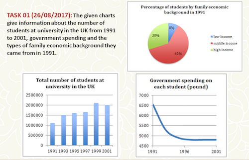
The given charts give information about the number of students at university in the UK from 1991 to 2001, government spending and the types of family economic background they came from in 1991.

A chart table, line graph and pie chart compare the total of British undergraduates, national student subsidy in pounds and family financial situations from 1991 to 2001. Family financial levels comprise low income, middle income and high income. Students grants were offered by government in pounds.

Overall, the number of undergraduates increased and peaked in 1999. Otherwise, there was a downward trend in student grants by government. The majority of students pursuing higher education came from middle income families in 1991 whereas one in eight students were born in the low income.

Clearly, the year 1991 saw 62% of 1.1 million university admissions were students having middle income families. They were the most financially supported throughout the period by the government with comparatively 6500 pounds each. The figure for undergraduates mounted to the highest of 2.1 millions whose personal government subsidy hit the bottom at 4750 pounds in 1999. It remained to finance 2 million students respectively in 2001.

Although the gross of British would-be graduates doubled from 1991 to 1999, the 2001's total registered a slight fall to 2 million. Also, government budget allocated per students decreased sharply from above 6000 to around 4500 pounds which persisted for the last two years of the period. However, students born in wealthy families were half as many as the middle income one, 30% versus 62%.

  • Slide1.png


Okapi99 2 / 2  
Jul 11, 2018   #2
I think your introduction a bit confused. Maybe you can try
The information is provided by a bar chart, a pie chart and a line graph. The bar chart illustrates....... The pie chart depicts....... The pie chart compares.....

I reckon it will be clearer .
Holt  Educational Consultant - / 15460  
Jul 12, 2018   #3
Yen, this is a very well developed and clearly presented analysis of the pie chart, line graph, and chart table. Your information, based on each provided illustration shows a deep analysis of the given information and the explanations are valid and related to the discussions. If there is one thing missing in your overall presentation though, it would have to be the trending statement. I do not see one in the overview or individual paragraphs for each of the provided measurement figures. Based on my analysis of each illustration, each image has a developing trend based on the numbers provided.

The middle class was the growing trend for students enrolled based on economic background, there was a decrease in government funding for the students enrolled, and the number of students enrolled showed an increasing trend. All of these information should have been part of the summary overview that you presented. This could have been presented as a single complex sentence at the end of the first paragraph or at the end of the essay if you wished to. Either way, it is a required part of the presentation that you neglected to properly present.


Home / Writing Feedback / The number of students at university in the UK from 1991 to 2001
ⓘ Need Writing or Editing Help?
Fill out one of these forms for professional help:

Best Writing Service:
CustomPapers form ◳

Graduate Writing / Editing:
GraduateWriter form ◳

Excellence in Editing:
Rose Editing ◳

AI-Paper Rewriting:
Robot Rewrite ◳