counting junk foods being eaten
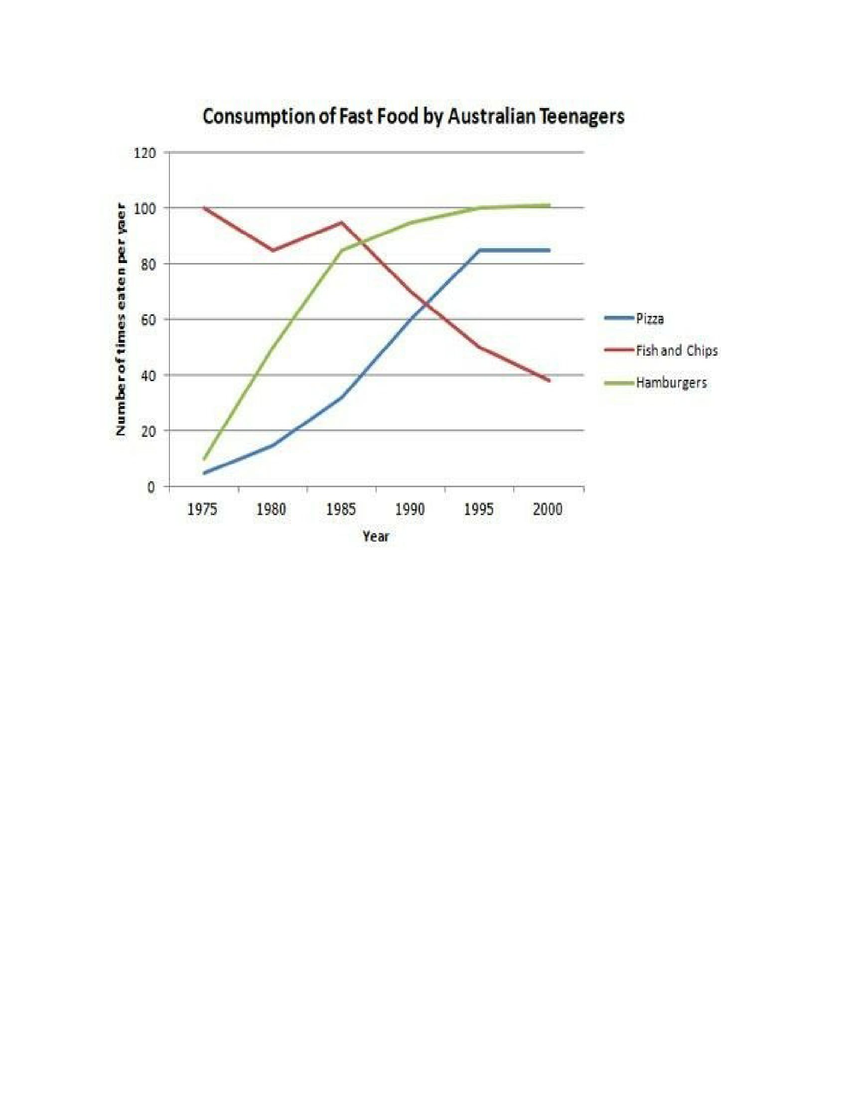
The given line chart compares the number of times that youngster ate 3 kinds of junk food namely pizza, hamburgers, fish and chips in Australia during the period of 1975 and 2000.
Overall, there was an upward trend in pizzas and burgers, while chips and fish had a downward tendency. It is clear from the graph that with the highest point of the total became the lowest point at the end of the period.
In 1975, pizzas and burgers were the lowest consumption, at just over 5 times eaten per year and around 10 times, respectively. Meanwhile, fish and chips are the most popular fast food, which were exactly 100 times consumed by Australian teenagers per year, followed by a small degree of fluctuation up to the year of 1985. The pizzas' intake climbed modestly to about 40 times in 1985. In the meantime, the burgers' eating experienced the same upward trend as pizzas' but rose significantly to nearly 90 times.
From 1985 to 1995, fish and chips saw a sharp decline and hit its bottom at approximately 40 times. At the same time, there were a steady increase in pizzas' and burgers' consumption and remained quite stable until 2000.Holt Educational Consultant - / 16014 Tran, the summary report that you made is good, but it can be better. For starters, the overview statement is too short. It doesn't fall within the minimum sentence requirement of 3 sentences. In my opinion, you could have combined the first and second paragraphs in order to create the proper information necessary in a summary overview.
Since you have a minimum paragraph requirement of at least 3 paragraphs, I suggest that you create 2 different paragraphs to meet the requirement. In the second paragraph, you could have discussed only the fluctuations that were created for each of the food type. Then in the third, you could have discussed the number of times the food was eaten per year. That way, the discussion becomes specific per paragraph and better illustrates the information provided.
That said, you did not do a bad job in this essay. It showed a clear understanding of the chart and you were able to present the information to the reader a clear enough manner. Congratulations on doing that. You have the potential to get better in writing this sort of essay. Just keep practicing. We will be here to help you out with advice whenever you need it. Just ask.

