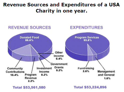
A ratio of the percentage of income sources and outlays by a USA charity in a year is displayed in pie charts. As it is noticeable, the amount of income sources and outlays was nearly balanced. What stands out from pie charts presents that the proportion of income sources was higher than expenditures in the last accumulation.
A nearer observation at the pie chart highlights that the percentage of contributed food gave proportion of 86% of all income in one year. The proportion of the financial support of community was the second highest which gave contribution of 10.4% of all charity's income. In addition, the other four sectors of income sources added percentage of 3% in the same year.
Turning to the outlays, the percentage of the program services was spending the highest of 95.8% of all outlays. The fundraising followed at the second biggest which spent to 2.6%. Although the percentage of management and general needed few budgets, it also spent to 1.6%.

The percentage of income sources and outlays
