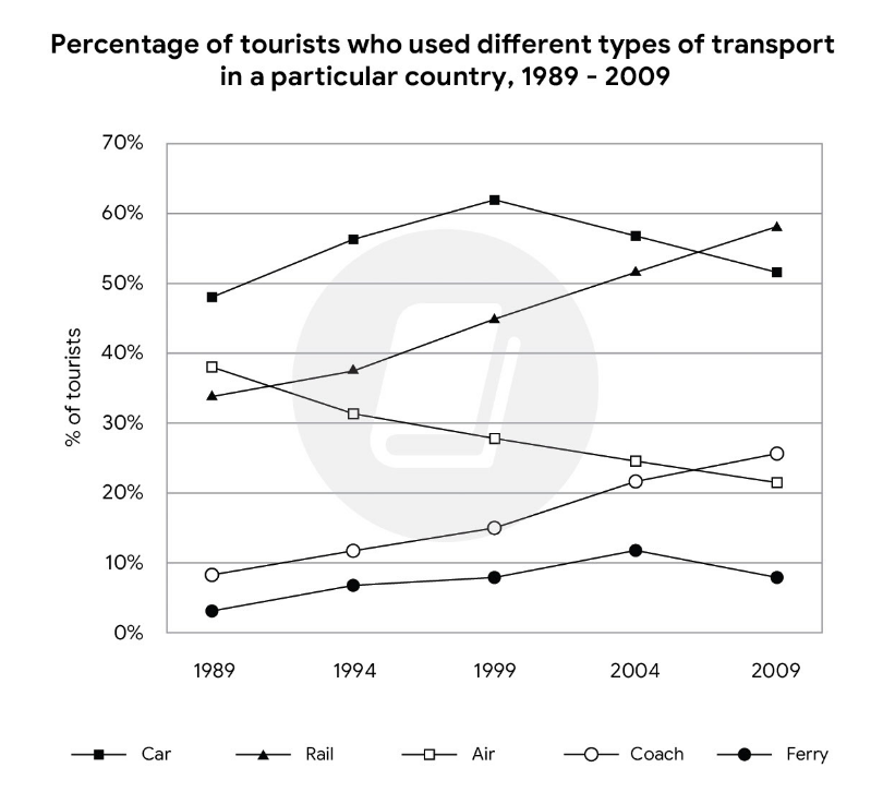
The graph below shows the percentages of tourists who used different types of transport to travel within a particular nation between 1989 and 2009. Each tourist may have used more than one type of transport. Summarise the information by selecting and reporting the main features, and make comparisons where relevant.
-->The multiple line chart above represents the percentage of visitors who used various means of transportation to go within a certain country in the period of 1989 to 2009. Bear in mind that each visitor may have used more than one mode of transportation.
Overall, there are not too many fluctuations. All percent of transportation forms increased over 20 years, except for air travel. Percent of tourists used Ferry normally was under 10%, and it always was the lowest percent among other means. In the period 1989 to 2004, Car was the most popular vehicle used by customers, but in 2009, rail had soard to record levels and replaced car to become the most common vehicle.
Over timeframe, ferry and coach were the least common types of transport although both of them increased. Ferry increased slightly from 1989 to 2004 and reached a peak of around 12%, then fell down to under 10% by the end. While coach increased significantly by roughly 15%, from less than 10% in 1989 to approximately 25% which higher than percent of air in 2009.
Meanwhile, the use of Rail followed very similar trends to Coach. Starting at around 34% and climbing to nearly 60% which is higher than percent of car in 2009. In 1989, nearly half of the customers came to this particular nation used cars. This figure continued to rise over 10 years and hit the high of over 60% before declining to just over 50% in the next 10 years. The line of air is contrast with other types of transport, as it experienced steadily decreasing by around 20%, just only nearly 20% left at the end of period.

Screenshot2024030.png
