students expenditures analysis
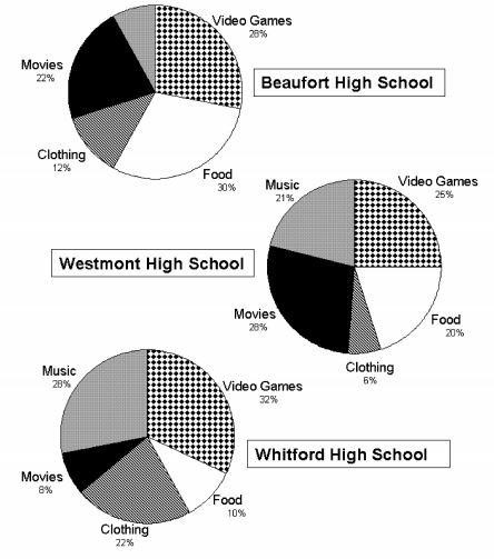
The chart below show what senior high school students in 3 different high schools (Beaufort, Westmont and Whitford) spent their money on in 2005. Summarise the information by selecting and reporting the main features and make comparisons where relevant. You should write at least 150 words.
The pie chart illustrated what seniors in Beaufort, Westmont and Whitford High School invested on in 2005.
Overall, students of the 3 schools had quite different preference in money spending yet they were all interested in 5 categories: Gaming, Clothing, Music, Movies and Food.
Of the 5 categories, Video games took up the largest proportion of spending by students of all 3 schools: Westmont's students spent a quarter of their total expenses on this activity; Beaufort's students spent 3% more than the Westmont, and about 32% was invested by Whitford's seniors. Watching movies was popular among last-year students of both Beaufort and Westmont (which took up 22% and 28% respectively), while significantly less money was spent on this leisure activity by the Whitfords. Similarly, Beaufort and Westmont students spend a total of 50% of their year's expenditure for eating, yet this category only receive 10% money from students of Whitford.
On the contrary, approximately one-fifth was invested on clothing by Whitford's seniors whilst less than 20% was dedicated to this area by both Beaufort's and Westmont's students. In the category of music, Beaufort's seniors seemed to have spent the least (8%) but students attending Whitford and Westmont High School spent over 20% (Westmont) and up to 28% (Whitford) for this particular activity.

spentmoney.jpg
